http://www.economist.com/blogs/graphicdetail/2016/11/daily-chart-0
The Chinese economy grew 6.7% in the third quarter. In the second quarter it was 6.7%, and in the first, err … 6.7%. Seems unlikely, don’t you think?
And the answer to that is not difficult: highly unlikely. Chinese statistics are known to be unreliable, not least because the sum of total economic activity falls almost precisely on the growth rate prescribed in China’s last Five-Year Plan. Neither the stock market crash earlier this year, nor the official statistic that 5% of outstanding debt is non performing, and no, not even the considerable fluctuations in commodity prices, are able to cause any volatility whatsoever in the growth rate. And they don’t do revisions in China, either, so while we have to wait till the end of December for publication of the definitive GDP figures for the US, it’s already tied off in China. So, 6.7% – yeah whatever.
At The Economist, they’ve taken the trouble to subject this apparent stability to a statistical test. How likely is it, really, that an economy can show exactly the same growth percentage for a full three quarters in a row? The Economist based this on a database of GDP growth figures from 83 countries and data since 1993, which I think we could comfortably consider a reasonably solid sample set. The outcome is shown in the graph above. So? Two quarters with the same growth rate occur with some regularity (see second column), but three quarters in a row is really very unusual (third column). In addition to China, only Spain (2x!) and Italy have managed to produce such a hat-trick in the past. The right-hand side of the graph then gives us the size of the quarter-on-quarter differences over the entire period. The idea behind this is that if an economy has a history of relatively small outliers, then there is a greater probability of seeing, purely coincidentally, three quarters in a row with exactly the same growth. Spain scores favorably in that regard, but China doesn’t.
Nice analyses, wrong chart
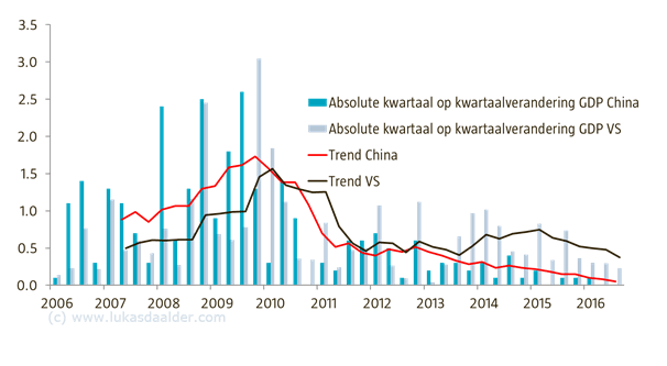
Nice analysis, but I still don’t really find this graph very effective. Solid, yes, but boring. Too many columns, no clear message. I’ve been using the graph below for some time now, which basically uses the same data. The turquoise bars show the absolute changes in Chinese growth, quarter-on-quarter. Given that we have already seen three quarters of unchanged growth, the last two bars produce a zero. The red line then gives us the average of the last six quarters. The gray bars and the black line show the same again for the US economy, as point of reference. The average deviation of US growth over six quarters is currently at 0.38, while the lowest score that the US has managed since WWII was 0.24 (end of the 90s). In comparison, China’s score is currently 0.05…
Variation in Chinese growth declining

Source: Robeco, Bloomberg
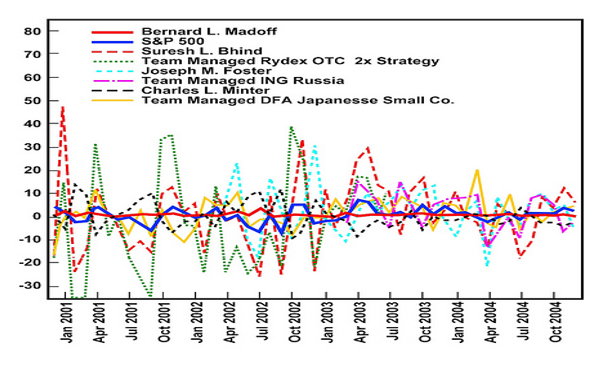
Madoff
But it gets really bizarre when you realize that the average growth of the US economy is currently around 2%, with China’s official figures somewhere around 6.5%. So the higher the growth rate, the greater the variation, you would think. Err, no. Comparisons with Madoff’s investment results come to mind here. Those results also showed an excessively low volatility, given the markets in which Madoff claimed to invest, or the volatility of his peers. But we all know that those results eventually turned out too good to be true.
In short: I wouldn’t lay much store by the Chinese GDP figures. After all, the Chinese authorities don’t do that either, witness the WikiLeaks of Li Keqiang.