http://larrysummers.com/2016/09/30/four-modifications-to-feds-current-posture/
Predicting is not easy. And even the US central bank is making a pig’s ear of it too, according to this week’s graph(s).
I’ve got two graphs for you this week. The funny thing is, while both being based on the same underlying data, they appear at first to give us two contrary pictures. One shows lines that trend downwards, but in the other we see some twenty lines heading north. The same data, totally different picture. Fortunately, however, they’re giving the same message.

So what are we looking at? Basically we’re looking at how reliable the predictions are of the Federal Reserve (Fed), otherwise known as the US central bank. Since 2013, the Fed has been giving predictions for a number of variables, including expected growth, inflation and rate levels. The idea behind issuing these predictions was that it would provide financial markets with a better estimate of how the Fed viewed the US economy. The direct trigger for this was the strong rise in US capital market rates in 2013 that corresponded with the ‘taper tantrum’: fears that the Fed was going to stop buying up treasuries was enough to drive up US capital market rates by nearly 1.5%. By issuing expectations related to future policy for the coming years, the Fed managed to restore calm to the markets.
Policy rates
These graphs look specifically at the predictions that the Fed has issued on policy rates. It’s blindingly easy, really: predict what will happen in future with rates – rates that you’re in full control of. You would think therefore that there’s very little that could go wrong with this plan, but it turns out that nothing is further from the truth. Since 2013, the Fed has fairly consistently predicted that it expects rates to rise over the following years. We can see, for example, in the second graph that in September 2014 (orange line) the Fed expected interest rates to rise to 2.5% by the end of 2016. Since the Fed issues a new prediction four times a year, we get a wide spectrum of lines, all heading skywards. Incorrectly, as it turns out, since the black dotted line shows us what actually happened to policy rates: we’ve barely risen above 0.4%.
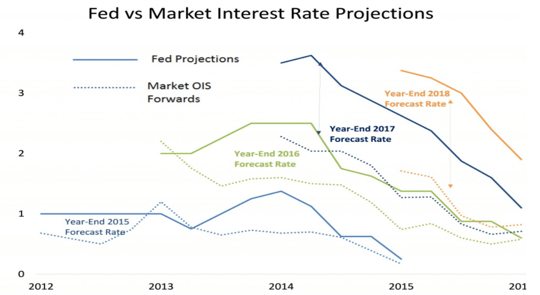
Whereas the rising lines in the second graph show that the Fed has for many years been predicting higher rates ‘next year’, the first graph tackles this differently. We are looking specifically here at how the Fed’s expectations over the course of time have developed in terms of a specific end point. The green line, for instance, shows what predictions the Fed has issued for rates at the end of 2016: in September 2013 that was still 2.5%, but in early 2014 it fell to below 2% and continued downwards with every new prediction. And that gives us falling lines that show the persistently disappointing growth dynamic of the US economy.
Prediction?
There are two ways of looking at this. The first is that you ask yourself if we should really see the Fed’s estimates as predictions. To say the least, it would be remarkable if the Fed had issued a (retrospectively correct) estimate in 2014 that rates would be at 0.5% in late 2016. The market consensus at that point assumed rates of around 1.5%, so it would have been a relatively negative estimate. What does the central bank know that we don’t know, market participants would have wondered, which would in turn have led to restless markets. The role of a central bank is to create calm and clarity, not to predict trouble. In that sense, a central bank will seldom – if ever – issue a prediction that falls below market expectations. It’s not much more than elevator music: you’d do better not to listen to it too closely.
However, the second way of looking at this is a little less innocent, which is exactly what Summers – our source for the first graph – is trying to tell us. This relates to the dotted lines that we also see in the first graph, but that I haven’t yet dealt with. While the thick lines give us the Fed’s expectations, the dotted lines show us how the market viewed rate developments at that point. Although we see the difference in rate expectations between the Fed and the market rose more or less uniformly in late 2015 (both blue lines), you’ll notice that the gap in expectations for 2016, 2017 and 2018 grows each year. Summers indicates that trend with the two vertical arrows on the right-hand side of the graph – notably the yellow arrow is quite a bit longer than the blue one. His message: the market no longer believes the Fed and a Fed with no credibility is dangerous. What’s more, the very reason for issuing these estimates – creating clarity for the market – is thus completely undermined: eventually no one will listen anymore to the elevator music, even when it becomes really important to do so.
Summers has got a point, but I think he’s gone too far in his argument. On his blog, he says the following: “It (the Fed) should recognize output and inflation and unemployment would all be closer to their target levels today and in their forecasts if rates had not been increased last December.” As if that meaningless quarter percent increase in rates December last year had any noticeable effect on the US economy… If that was the case, then we’ve no need to worry at all about the effectiveness of monetary policy…
