http://uk.businessinsider.com/revenue-growth-is-anemic-2016-5
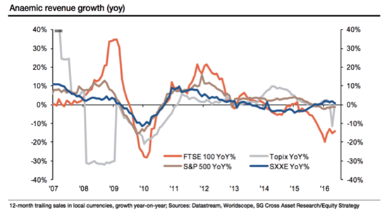
Today’s graph of the week shows a disturbing picture of the revenue growth of listed companies. Worrying – or not?
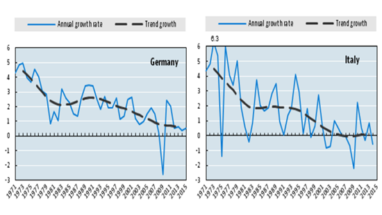
If you’re looking for proof that economic growth has not been so brisk in recent years, you don’t have to look far these days. Whether you’re looking at GDP growth or labor productivity, the picture is the same: lots of lines gradually trending towards zero. To give you an example, I’ve shown two graphs (from a series of seven) that clearly illustrate my point: labor productivity since the 70s for Germany and Italy, originating from a report published last week by the OECD. The picture is clear: though there are surprises to the upside year-on-year (blue line), the trend (black line) leaves little to the imagination. And this picture is repeated all over the place.
But I always struggle with this message. How is it possible that productivity is falling in a period in which there are unbelievable technological changes afoot and the unstoppable rise of computers is leading to greatly improved efficiency? The problem with these graphs is that they are all based on a single underlying number: Gross Domestic Product (GDP), the one great sum of economic activity. If you then combine the GDP figure with the input of labor, you end up with labor productivity numbers. So if GDP is incorrect, then labor productivity is off beam too.
But why would GDP not be correct? Well, there are a number of reasons. Firstly, the rise of free services like Wikipedia and nu.nl are leading to negative growth. These services cost nothing and are therefore beyond the scope of GDP statistics. At the same time, they come at the cost of the current (traditional) growth of newspapers or reference works, for instance. Secondly, it’s a matter of some debate as to how you measure the ‘production’ of services: how much does a teacher or a public official contribute and how do we measure productivity growth? The short answer: we don’t actually do that. We just add them on the basis of their salary. With the increasing importance of the services sector in the total economy, this means growth will become less dynamic. Thirdly, you’ve got the problem of strong improvements in the quality of mobile phones, for instance. The smartphones we currently carry in our pockets have far more functionality than a cellphone of five years ago, but cost less (depending on the brand, of course). Although a correction is made to cover this in the GDP calculation, the question is whether this correction is sufficient. In short: there are quite a lot of further implications involved in the GDP numbers, as I have previously stated (here and here, for example). But I’m definitely not the only one to express such criticisms: a hypothesis has even been named for this – the MisMeasurement Hypothesis (MMH).
No GDP figure
And now to today’s graph of the week. The great thing about this graph is that it doesn’t look at GDP figures, but considers revenue growth as reported by companies that are listed on the four leading international stock exchanges. So basically an alternative to GDP numbers. Public officials and teachers aren’t usually included and no changes are made for the underlying improvements in products, so many of the shortcomings we’ve stated are not obviated. Wikipedia still doesn’t join in, but companies like Facebook and Google are included (though we could quarrel about what exactly their turnover represents, but we’ll leave that aside for now). In short, a good alternative. But what’s the upshot? We see a falling trend here too.
So do I have to accept this unavoidable conclusion? Before I do that, I’d like to make a couple of comments. The gray line, for instance, shows strange outliers, which seems to suggest that the Japanese data is not entirely reliable. Further, the picture is also strongly distorted by the axes: by framing this from +40% to -40%, you barely see the difference between 2% and 4% growth, a difference that is usually not considered insignificant. Furthermore, the impression the graph gives is strongly influenced by the decline in the orange line: if you extract this from the graph, then the downward trend in 2015-2016 also becomes much less pronounced.
But this also begs the question as to why the orange line (the UK) is declining so fast. The answer: on the UK market, oil and commodity producers are over-represented, while the financial sector also weighs heavily there. The first two sectors are of course having a rough time of it as a result of price declines on commodities markets, which would also partly explain the downward trend in the brown line (of the US). This is a real effect, certainly, but now that oil prices are rising again, you can also expect another reversal in the trend. As far as the financial sector is concerned: these companies have been very busy selling off various operations in recent years. Corporatization and sales (outside the stock market) are leading to a reported decline in revenues, but that does not of course have to mean that growth is also lower.
So it’s a great graph that appears, at first sight at least, to show what the GDP figures also suggest: growth deceleration. Maybe I just have to let my resistance to this conclusion go this time …
