Good morning. Some cool charts comparing the Chinese stock markets with the rest of the world
http://graphics.wsj.com/gallery/china-market-explainer
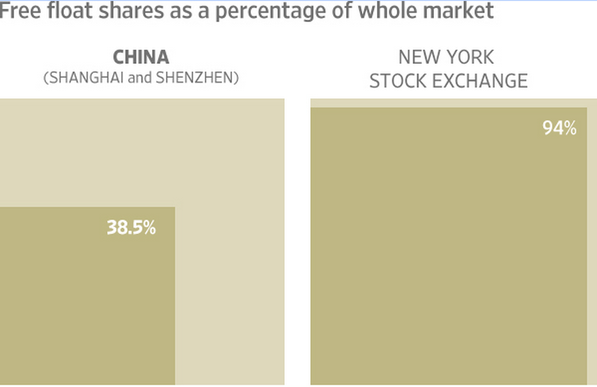
And here’s another one on China
http://ftalphaville.ft.com/2015/07/28/2135557/china-vs-its-stock-market-charted/

Spot the difference: income distribution of 1975 compared to that of 2010
http://www.bradford-delong.com/2015/07/must-read-visualizing-economicshttpvisualizingeconomicscomviewincomeguide-created-by-catherine-mulbrandon-a.html


Always interesting, even though I have shown this one before
https://twitter.com/NickatFP/status/626394438839988224

Nice charts showing the growing importance of China (via http://www.ritholtz.com/)
http://www.nytimes.com/interactive/2015/07/24/business/international/the-world-according-to-china-investment-maps.html

A complete overview of all previous editions of Best of the Web can be found herehttp://tinyurl.com/c8ge4c5. All links provided are collected from public websites, unless otherwise specified. I have not checked the data or information for accuracy used, and therefore do not guarantee that all data provided will be 100% correct. The links provided do not necessarily reflect my personal opinion and should be seen as general interest: oftentimes I do not agree with arguments presented, but nevertheless think it is worthwhile to read them. It is up to the reader to make up their own mind. Suggestions or discussions are more than welcome. Do not quote unless specifically cleared beforehand!
