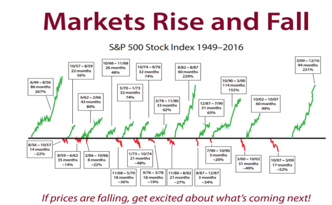
Today we’re looking at a graph that gives a bit of a long-term perspective. However, the question is, is that perspective right?
This week’s graph shows the gains and losses on the S&P 500 since 1949. The long, green lines show the gains and the short red ones the losses. The message seems simple enough and above all, encouraging: in the long run, the gains have prevailed.
It’s a nice graph, but unfortunately, it’s not right. When I shared it on Twitter, people quickly complained that the 1990s rally really was the biggest one since World War II and that the 2011 correction appeared to be missing. I thought I could counter the latter remark by saying that only corrections of more than 20% were included. However, that turns out not to be true: in neither the 1959-1962, nor the 1976-1978 correction did losses reach that level. Puzzling.
I did my best to work out where this graph’s creators went wrong, but no matter how I manipulate the data, I can’t seem to explain what happened to the 1990-2000 period: the S&P 500 rose from 295 to 1527 during that time, which is indeed a whole lot more than the 155% increase shown by the graph. In fact, according to the 20% rule, the correction of the early 1990s should actually − strictly speaking − have been left out: from July to October, the S&P 500 fell 19.92%, which is just short of 20%. If you disregard that correction, the rise in the S&P 500 between 1987 and 2000 amounts to a whopping 580%. In the graph below I have set the limit at 19% for the sake of convenience, to eliminate all the borderline cases.
The modified version actually does look a bit different…

Source: Robeco & Bloomberg
Now of course someone will accuse me of putting a positive spin on things. By lowering the limit from 20% to 19%, I split the last rally into two parts and the outlier on the right seems a lot less ominous than in the original graph. In my defense, I could theoretically argue that on an intraday basis, the loss did, in fact, exceed 20% (21.6%, I have been reliably informed), but I don’t think that’s all that important: the point is, you shouldn’t jump to conclusions based on an arbitrary number like 19% or 20%. It’s not the extent of the price gains, or even the length of the rally that ultimately determines how long a good run lasts, but rather those gains in relation to earnings growth, liquidity, monetary policy, returns on alternative investments, etc., etc. Of course, you can’t ever predict when a correction is coming purely on the basis of a single line. So whether that last outlier comes out at 145% or 300% is not all that meaningful.
A positive spin
Speaking of a positive spin, let’s briefly go back to the source of this graph. The original text states:
“This chart clearly shows that when stock prices are rising, they rise a lot and for a long time. When prices fall, they fall a little and for a short period.”
Maybe it’s just me, but dismissing the market corrections of 2000-2002 (-50%) and 2008-2009 (-56%) as ‘a little and for a short time’ strikes me as a bit simplistic. Sure, that’s the picture this graph paints, but that’s because visually, it doesn’t do justice to the price declines. By definition, the lower limit in a graph showing percentage changes will automatically be -100%. And because such a graph has no pre-defined upper limit, if the underlying index fluctuates a lot, losses will always seem relatively modest. After a 50% drop, you need a 200% rally to get back where you started, and after a 75% drop, a rally of 400%. That means that while there appears to have been a small drop and a big rise in prices, on balance, you haven’t earned a cent.
The right way to illustrate the difference between a drop and a rise in prices is by showing the two in the same way. The graph below compares apples and apples: the green lines show the rallies, and the red lines (inverted), the corrections. This graph also shows that US stocks did well in the long run, but that the losses can be quite heavy, too.
The drops are definitely not trivial

Source: Robeco & Bloomberg
The second graph puts the current rally more into perspective. Sure, prices rose sharply, but they have also dropped considerably over the last 17 years. So is there still room for optimism? As mentioned, I don’t attach much value to the movement of this one line. I care much more about the fact that the US market’s Shiller PE is now well above 30, a level I definitely find troubling. So you won’t hear me claiming there won’t be risks ahead.
