Source: Robeco, Bloomberg
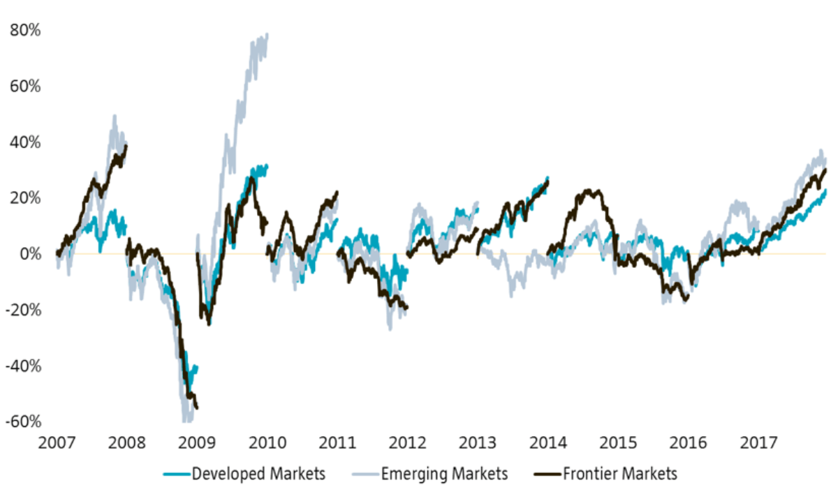
For a change, today’s graph of the week is going to be a quiz: which market would have been the best investment?
This week’s graph shows the development of three ‘markets’, as defined by the MSCI. The blue line gives us the return of a basket of stocks in the developed world (MSCI World), the gray line the return of a basket of stocks in emerging countries (MSCI EM), and the black line a basket of stocks in so-called frontier markets (MSCI FM). This last term is probably less well-known, and covers a group of countries that fall just outside the group of developing countries, because the market is too small, or has been under capital restrictions, or where development is simply still in its infancy. On balance, it’s a diverse group of countries, varying from Vietnam, Estonia and Kenya to Argentina, Sri Lanka and Nigeria. There are several lists in circulation, because there is no consensus about the definition of frontier markets.
Not very surprisingly, frontier markets are considerably less important than the other regions. Based on Bloomberg data, the market capitalization of the index is a mere USD 345 billion (although there are other numbers out there). That might sound impressive, but it means that the MSCI FM represents just 0.6% of the combined market scope of the three indices. The frontier markets fit some thirty times into the emerging markets, so we really are talking about a niche market.
Frontier markets are just a sliver of the total market

Source: Robeco, Bloomberg
This level of capitalization is and will remain just a small fraction of the total. The simple reason for this is, of course, that some frontier markets are promoted from time to time and continue as ‘emerging’ markets. This can have a serious impact on the market scope of the index. The graph below shows the development of the market cap of frontier markets, with the promotion of the United Arab Emirates and Qatar standing out unmistakably: on that day, the market cap of the index fell 40%. Such a re-qualification doesn’t create any losses in itself: after all, the price of the underlying index didn’t fall that day either. However, if you had been invested in the MSCI FM Index at that point, you would suddenly have found yourself carrying a much greater exposure to the other (less liquid) frontier markets. Hardly what you want. Such low liquidity is risky, especially if you want to be able to withdraw funds quickly. That this was not a one-off exercise will be amply demonstrated if Argentina gets promoted: that country currently accounts for a 21.6% weight in the index…
Promotion of countries leads to structurally low liquidity

Source: Robeco, Bloomberg
Emerging markets?
But I digress: back to the first graph. Three markets, with all three cases encompassing the total return (including dividend) in dollars for each calendar year since 2007. This immediately explains why the line does not run continually, but returns to zero at the start of each year. In principle, this gives a fairly accurate picture of which market performed best in which year. However, it does mask the long-term returns of the three indices. And that gives us a great opportunity to conduct a quiz: which market did best?
If you purely count the tally, then I think you would conclude that emerging markets (gray) take the credit: this region chalked up five of the last eleven years. Apart from that, the really striking outlier is the 80% in 2009 (comfortably twice the rise in developed markets that year). And yet it’s not emerging that showed the best performance over this period. The graph below shows the development of the three indices:
And the winner is…

Emerging markets were the best choice in the 2007–2011 period, but after that they simply couldn’t keep up with the gradual rise of developed markets. This picture is more pronounced when you look at the price gain in euros: the combination of the heavy weight of the US equity market and the value increase in the dollar versus the euro over this period of time, played into the hands of the MSCI World (in euros) in particular, and was less clearly felt in the other two indices.
The real outlier in this graph is, of course, the black line of the frontier markets: as an investor, you haven’t really been compensated over these last 11 years for the extra risk that you’ve taken on board by investing in these illiquid markets. And even in the two yeas in which the frontier markets were the winner, the difference with number two was limited.
Looking back, the frontier markets have definitely not been able to demonstrate their added value. Of course, this tells us nothing about the future. One advantage is that it is a relatively cheap market: according to Bloomberg, you currently pay 17 times expected earnings for emerging markets, whereas frontier markets cost just 14 times. Another (striking) characteristic of frontier markets is that the daily volatility is lower than that of both the MSCI EM and the MSCI World. Whether these two points are sufficiently large to enter this market, remains to be seen, of course. As a portfolio manager, low liquidity is a point of concern, and the main reason why we don’t allocate to this ‘region’ at the same time.
