https://www.schwab.com/resource-center/insights/content/are-stocks-too-expensive
In a world in which it seems that everything is only rising, today a dissenting voice: a falling line. And it may well be good news, too.
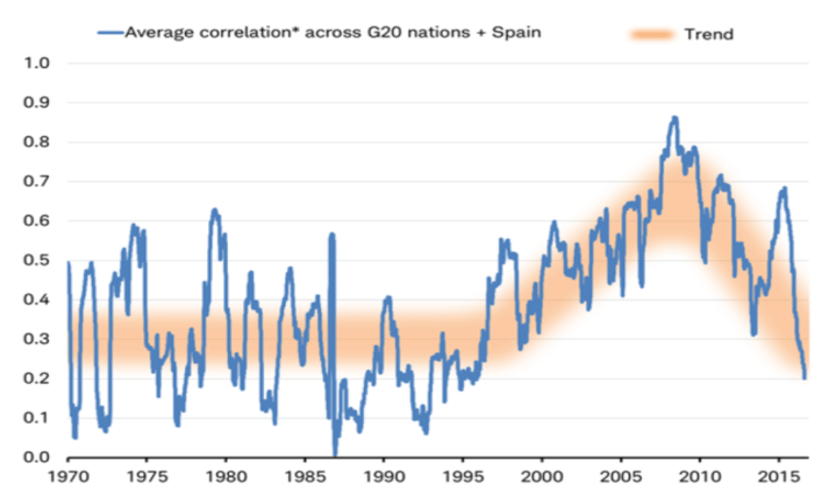
At first glance, it is a very simple graph: one line to which they have added some orange highlighting for clarity’s sake. And yet behind this line hides the market movements of no less than 21 countries, not to mention the calculation of 200 correlation pairs. All things considered, this line really does push the boundaries of the computing capacity of Excel.
But I am getting ahead of myself: what does this graph basically show us? In simple words: the level of synchronization in international stock markets over time. The higher the line, the more the markets co-move in the same direction, and the more synchronized this movement is. So the height of the line doesn’t tell us anything about the direction of the markets, which is easy to see if you look at the graph’s peak. This fell in September 2009, when all markets were gripped in the so-called subprime crisis in the US. In the period up to March 2009, we saw a total bloodbath, with all markets suffering heavy losses. But after March of that year, markets bounced back northwards. National affairs or corporate results momentarily played no role, and all markets moved synchronously and the correlation between markets was very high.
This part may be a bit geekier, but I will put it in nevertheless to explain the complexity of the chart. To create it, you first look at the correlation of two markets, say the US and Germany. You calculate the one-month change in both markets (based on daily data) and then compute the correlation of that series over a period of a year (hold on, we’re nearly there). This gives you a line that shows the continual course of the correlation between the US and German markets from 1970. You then repeat that process for the US and French markets, the US and Chinese markets, the US and Russian markets, et cetera. With 21 countries, that gives us 20 correlation series with the US market, but then you’ve got the German-French, German-Chinese, German-Russian, et cetera, followed by the UK-Chinese, UK-Russian and then all the rest. With 21 countries, this gives us 200 correlation series. If you then take the average of these, you arrive at the line above.
Check, double check
And I should know, as I have recreated the connection. The reason for this was simple: it seemed somewhat unlikely that the correlation would currently be so low. Why would the underlying correlation between the international markets over the last 16 months suddenly return to its lowest level in years? The outcome doesn’t mesh entirely with the idea I had.
Although I didn’t include all the series (I left out the series Saudi Arabia and Spain) and I don’t understand why the graph could start in 1970 (the MSCI data for most countries doesn’t begin until 1995), I still managed to achieve a similar result (albeit it for a shorter timeframe).
Wow, it’s correct!

Source: Bloomberg, Robeco
So it’s correct, but what has caused it? The only problem is that with 200 series it’s not easy to ascertain where the decline came from. However, what I can do is show a snapshot of now and the period of August 2016. This is done by creating a correlation table which shows all the mutual correlations of the markets. The redder they are, the greater the correlation, while green, on the other hand, shows that there is low correlation. So, it’s the green blocks that could explain the decline. I start with the August 2016 table, when the correlation was still 64% (according to my calculations).
On 17 August 2016, everything was moving more or less in the same direction

A lot of red, very little green. If there was a dissonant factor, it was Argentina, where the market in local currency seemed to struggle to get anywhere. The red block of developed countries stands out too of course (upper left), and we also see that China, Canada and Australia show high correlations with the industrialized countries. That picture looks very different if you look at the most recent observations:
On 6 December 2017, things looked quite different

A lot of green, with emerging countries in particular (including China, Indonesia, Brazil and Mexico) showing anomalous movements. In many cases, we even see negative correlations, which shows that the markets have really chosen a specific direction.
So what’s the point of all this?
It’s all very interesting, but what’s really the point of it all? A lot actually. As an active investor, I’m generally happy that there is some differentiation going on: this means I have the opportunity to benefit from regional and national differences. For professional investors, non-correlated returns are pretty much the Holy Grail, and if you find them within a single asset class (equities), then that is a very positive thing. Furthermore, it is a clear signal that diversification really is desirable and useful in a portfolio. With a low correlation, fluctuations in one market are dampened by fluctuations in another, giving more stable results.
Before I get too enthusiastic: we are of course looking here at the past – it doesn’t tell us much about the future. And don’t forget we’re looking at local returns: if you want to calculate the real return of the Chinese market, you will of course have to factor in the related exchange rate.
