A new Federal Reserve chair: what do they have in store for us? According to the graph, the bond markets should watch out.
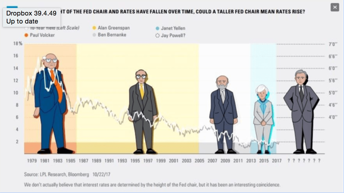
I think the disclaimer under this week’s graph says it all. We don’t actually believe that interest rates are determined by the height of the Fed chair, but it has been an interesting coincidence. No one actually believes there is a link between the height of the Fed chair and interest rates. And neither do I. This week’s graph should be filed away under the subject ‘humorous’ and not taken too seriously.
Even funny graphs can be worth a more critical look, though. When I look more closely at this one, a few things do stand out. First, as it turns out, confirming the exact height of the various Fed chairs is not all that easy. According to one source, Janet Yellen is 1 meter 60 cm tall, but other sources say ‘5 feet’, which is actually only 1 meter 52 cm. Not that it matters, particularly if you are researching a connection − which clearly doesn’t exist − between the height of the Fed chair and interest rates, but I want it on the record anyway, just in case.
More importantly, whoever created this graph did a shoddy job of it. While the little caricatures are pretty cute, that’s about the only good thing I can say about it. The fact that the line grazes Volcker’s head but barely reaches Yellen’s knee makes it impossible to say anything meaningful about the new chair. Will interest rates under the new chair be at knee (4%), belly (6%) or head level (10%)? It’s not clear. Which is a shame, because if you look at the next graph, the connection seems much stronger.

While I’ll admit that all the colors and caricatures in the previous graph are more fun to look at, the link illustrated by this one is considerably more robust. For each chair, the average bond yields during the course of their term is plotted on the x-axis, and on the y-axis, their (alleged) height. Assuming that Powell stands at around 1 meter 75 cm, leads to the rock-solid prediction that bond yields will be 5.5%. But remember, this figure is supposed to be an average for the entire term, and as such would be a huge move from the current 2.3%.
Is it possible?
Let’s give Powell the benefit of the doubt and assume that he, unlike Yellen, will stay chair for the entire eight-year term. Is it feasible that bond yields could average 5.5% over that time? While it certainly isn’t likely, you could of course come up with a scenario in which it is possible. Let’s say Congress passes Trump’s tax reform plans (which would raise the gross national debt) and the Federal Reserve also starts shrinking its balance sheet (thereby creating more debt that has to be absorbed by other parties). Suppose the US sees a sharp rise in wages during the same period and you’re off to a pretty good start. If we also assume that the Fed is taken unawares and maintains too accommodative a monetary policy for too long, it could result in a huge shock for the bond market. Such circumstances could unleash a classic wage-price spiral, where a fear of future inflation could trigger a considerable increase in bond spreads.
While none of this sounds very likely, I have checked to see when was the last time that bond yields averaged 5.5% over a period of eight years. In the Netherlands, you have to go back to 1995-2003, but in a country such as Australia, it was more recent: 2003-2011. And incidentally, in the US, the last time it occurred was between 1996 and 2004. In other words, I’ve seen it happen before in all of these places. ☺
It should be noted, however that this isn’t the first time predictions have been made about the financial markets based on the height of the Fed chair. The graph below came out when Yellen took office in 2014. The heights are plotted on the y-axis, and on the x-axis average S&P 500 annual returns… I can’t think of a better way than this to show just how ridiculous these graphs actually are: Since Yellen took office, US stocks have had an average annual return of 10%. You can also invert it: for the prediction to be true, the value of the US stock market would have to drop 40% over the next three months.
I, for one, am not worried about it.

