http://theirrelevantinvestor.com/2017/05/12/the-best-place-to-be/ – May 2017
Investment returns are erratic, even in the US markets.
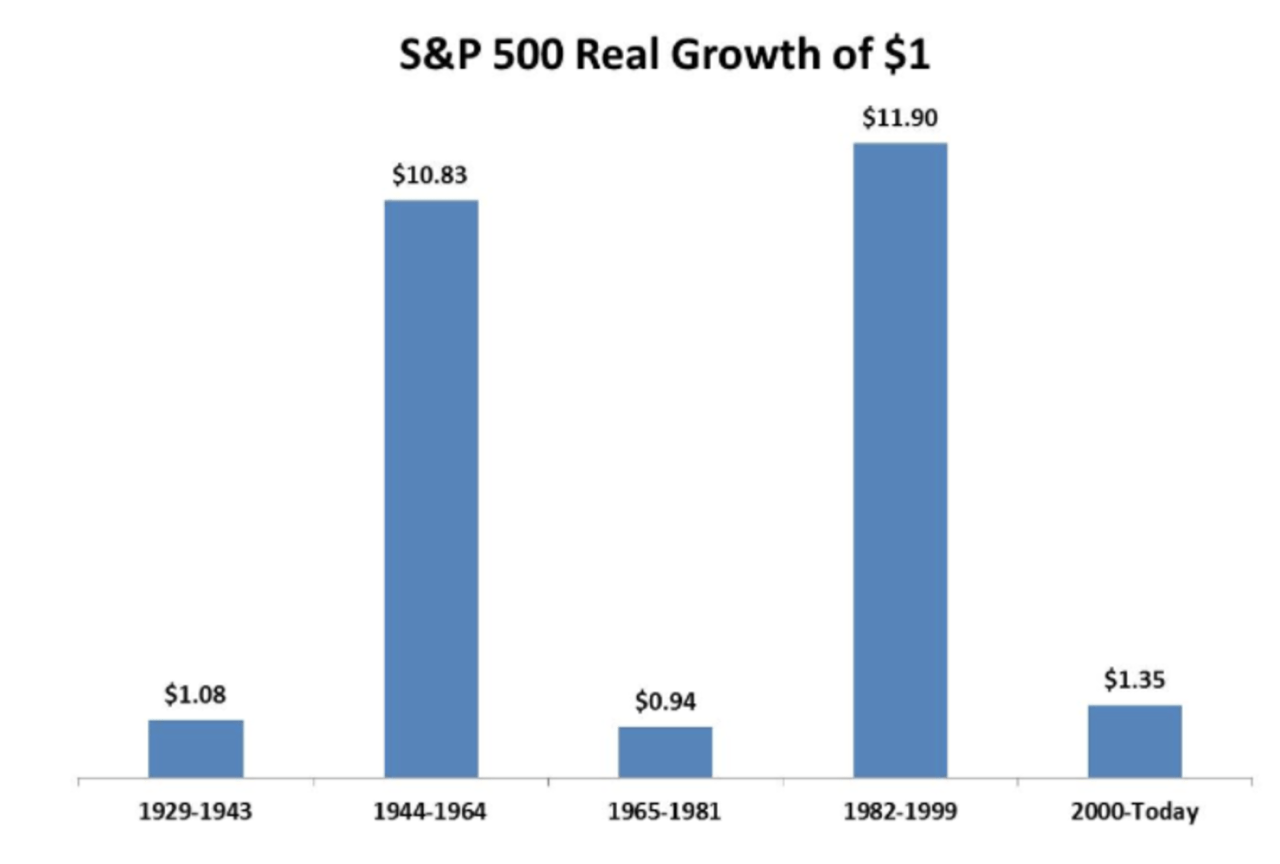
I’m the first to admit that this graph doesn’t look all that intriguing. Just five bars, that’s all. Let’s just say it isn’t the most exciting we’ve seen. But don’t knock it, this way of illustrating the US market’s performance is actually quite interesting. What it shows are the returns you would have generated on the S&P 500 during various periods. Specifically, the graph illustrates returns including dividend, adjusted for inflation. In other words, real returns.
The first bar shows that if you had invested USD 1 on the S&P 500 in 1929, by the end of 1943, that dollar would have been worth USD 1.08. So the real return for the entire period was only 8%, which means the average annual return was just a measly 0.55%. But there were better times ahead: during the 20 years represented by the second bar, the return was almost 1000%. In these 20 years that included the end of World War II and the period immediately after, your annual real return would have been 12.7%. But the lean times returned: in the next 16 years, your return would actually have been negative. The message is: the stock market is turbulent.
This graph also goes to show that how you present the data can completely change the message. This second graph shows the exact same data, only the time span is a bit longer. It also shows the real returns including dividend on the S&P 500. While you can’t quite call it a straight line, this graph does make investing seem like child’s play: there is a clear trend, and even where the line deviates, it never moves very far. If I were a used car salesman, I’d definitely go for the second graph. Nice returns, so don’t worry!
But the stock market’s not that volatile…

Robeco, Shiller data – July 2017
Of course, you can also go to the other extreme and plot the real returns in a drawdown graph (click here to find out how these graphs are created). When it comes to stock market volatility, this graph leaves little to the imagination: losses of 40% crop up with some regularity. If you had been unlucky enough to enter the stock market in, say, September 1929, in real terms, three quarters of your capital would have gone up in smoke in about three years − we can only imagine how painful that would have been… Speaking of painful: just look at the spikes in 2000 and 2008. After that double whammy, it would have taken almost 13 years to recoup your losses, even longer than in the 1930s.
Or is it?

Robeco, Shiller data – July 2017
What I find most interesting about this last graph is it shows two peaks which are rarely ever discussed. The first one occurred between 1916 and 1924 and the second between 1973 and 1984. The reason these are hardly ever mentioned is because we tend to look at real returns: the losses were largely due to a sharp rise in inflation. So even though the stock market may have risen during that time, prices rose even faster. On balance, that of course didn’t lead to any positive real returns.
So I rest my case: definitely erratic.
