https://mainlymacro.blogspot.nl/2017/03/international-gdp-per-capita-comparisons.html
Which economy grew faster in 2016: the US or the Eurozone? It is perceived to have been the US, when actually, it was the Eurozone.
Admittedly, the margin was small. In fact, it’s a bit like a photo finish: it’s so close that calling a winner is impossible until the final GDP figures are in. But still, as it stands now, the US and Eurozone economies grew by 1.6% and 1.7%, respectively. Based on these figures, the US had a disappointing year, while the Eurozone did pretty well.
How can just 0.1% mean the difference between a disappointing year and a good one? The figure seems too marginal to justify such a claim. Keep in mind that this graph isn’t comparing the zones’ yearly growth, but their so-called underlying, or trend rate of growth, with each other. This trend growth cannot be observed directly, which is why it’s often done indirectly. The simple method is to look at 1) underlying growth in the workforce and 2) labor productivity growth. This in itself is easy to understand. For example, to calculate a factory’s total production output, you can look at the numbers of workers and products each one produced (=productivity). To raise productivity, you can either hire more workers, or make your existing workforce more productive (e.g. by training staff or increasing automation).
From this simple observation, it follows that US trend growth should, on balance, be higher than the Eurozone’s. Where Europe is struggling with an aging population and therefore a workforce that is already beginning to shrink (-0.2%), in the US, the workforce is still growing by 0.5% per year. Based on these underlying trends alone, the US economy could be expected to grow 0.7% faster. Plus, an aging population is often considered less productive, because older workers are less flexible. If this is true – and research on this has produced conflicting results –it could mean that the European economy actually turns out to have grown slower than the US economy.
Only temporary?
The point is, we generally tend to focus on absolute economic growth. However, that distorts the comparison. If a country’s population grows by 1% annually, consumption is likely to increase by about the same amount, leading to more investment and higher government income and spending in its slipstream. Conversely, if an economy shrinks, consumption and investment will decline too, which will hurt the economy. For this reason alone, it is not surprising that the Japanese economy generally grows more slowly than the US. To compare the US with the Eurozone, you’ll need to allow for that ‘external’ growth factor.
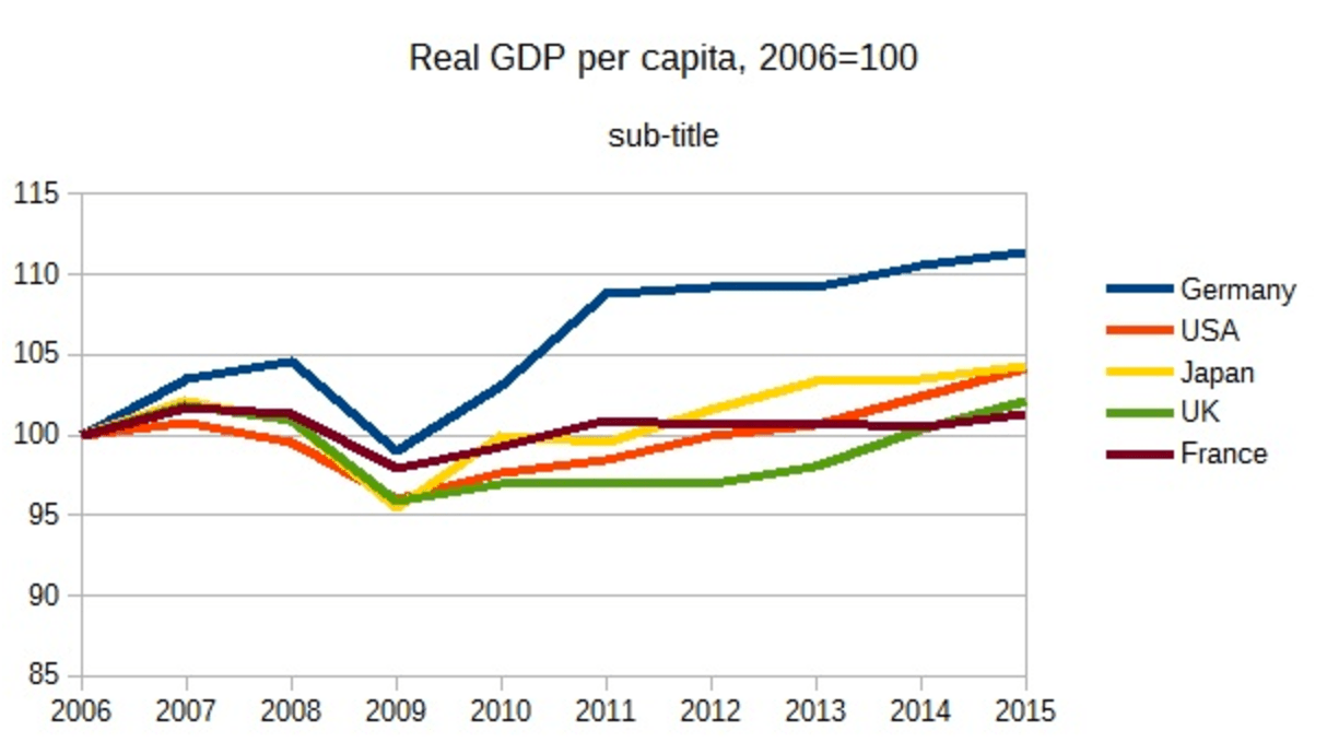
And that’s exactly what they did in this week’s graph. It shows the growth of per capita GDP − i.e. the size of the economy per member of the population. In the long run, the per capita GDP will be about equal to a country’ underlying growth in productivity. So it can be used to measure the health of the underlying economy. In the short term (which in this case can easily be ten years), however, productivity growth and per capita GDP growth are clearly different. Barring wars, the population may not vary appreciably, but the workforce can show considerable fluctuations. And this is not only due to aging − changes in unemployment are also to blame. After all, if you start with a large pool of jobseekers, the rate at which they are employed can easily outpace the rate at which the workforce grows (or shrinks). So while it’s not ideal, per capita GDP is certainly a more accurate measure than absolute GDP growth figures.
US is not outperforming Europe, it seems
As it turns out, the US did not perform much better than Europe in the longer term, either. In the graph above, which shows the trends in per capita GDP over the last ten years, the US is rather an average performer, nothing more. In fact, from 2006, US GDP per capita growth was exactly the same as Japan’s. However, the real outlier is Germany, head and shoulders above the rest. That’s largely due to the steady drop in unemployment during this period, rather than a higher rate of productivity growth. So, there were just more bodies doing the work.
I’ll leave you now with one more graph, showing GDP per capita growth in a larger number of countries over a longer period of time. As in the first graph, here the black bars show growth from 2006 to 2015. Here, Germany is the positive outlier out of all the European and North American countries (except Ireland). However, over a longer period, as represented by the blue bars, Germany actually doesn’t do all that well. By comparison, the Netherlands and Japan fared better. The UK scores particularly well over the long term, but judging by the short black bar, that was mostly thanks to a big growth spurt occurring between 1980 and 2006.
Productivity growth: once upon a time…

Source: Robeco, IMF
Note that the main takeaway here is less about which country grew fastest, but rather, the two very depressingly negative spikes at the bottom: Greece and Italy. If you think their problems are a thing of the past, I would beg to differ.
