https://www.weforum.org/agenda/2016/11/america-states-world-largest-economies
How large is the US economy, really? This week’s graph puts it nicely into perspective for us.
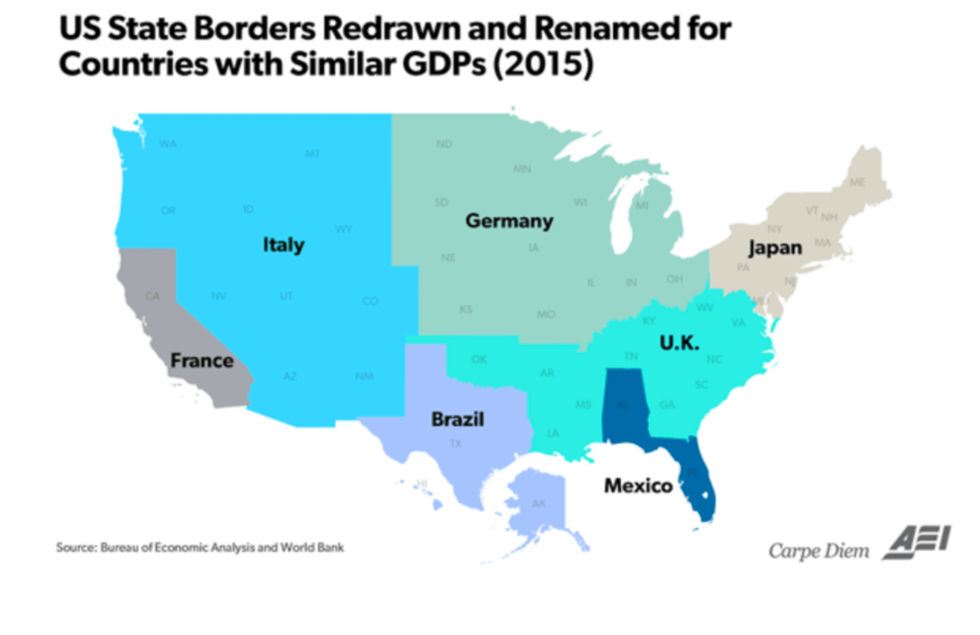
Our graph this week requires very little explanation. It gives us an idea of the size of the US economy by chopping the nation into seven pieces and then comparing them with other countries. California for instance is the size of France in economic terms, the Japanese economy fits into the area New England / New York, and Mexico is the same size as Florida and Alabama. The US economy is the world’s largest, and is as large as number two (China), three (Japan) and four (Germany) combined. If you leave China out of the picture for a moment, as this graph does, then the US economy can swallow up the whole of Europe, getting Brazil and Mexico as a bonus.
It looks fun, but it’s worth mentioning that this graph is quite sensitive to the moment at which the data is taken. That might sound a little overstated. I mean, how much does the relative size of an economy really change over, say, one year? Based purely on growth numbers, the difference is minimal: according to the latest estimates, the US economy grew by 1.6% in 2016, with the European economy managing growth of – yes, you guessed it – 1.6%. Not much change there then. However, the major shocks come when we compare European GDP numbers (expressed in euros) to those of the US (expressed in dollars), using exchange rates of course. A rise in the US dollar translates into a 1-on-1 relative rise in the US economy vis-à-vis the rest of the world, but this does not signify that the US economy performed better than the rest. What’s more, a stronger US dollar probably means that US companies are less able to sell their products outside the US, so it more likely represents a minus than a plus.
We also see this effect reflected in the graph below. It’s the same idea, but this one compares each state separately. One key difference is that we’re looking here at data from 2009, and not from 2015, as is the case with the first graph. One striking difference is that the Californian economy is no longer as large as the French economy, but now compares to Italy’s economy. Given that the French economy is some 33% larger than Italy’s, this clearly shows that such a change can never be explained by the growth differential between France and California alone – the 26% drop in the euro versus the dollar is the main culprit here. And the Netherlands too has declined strongly in the overview owing to the euro: in 2009 we could still proudly claim that the Dutch economy was as large as Florida’s, but we’re now shrinking towards Illinois…

http://www.economist.com/blogs/dailychart/2011/01/comparing_us_states_countries
So what about the Netherlands?
Enough about the US. How large is the Dutch economy in international terms? If we look at the provinces, then we arrive at the following map:

Source: Robeco, World Bank
South Holland is the largest provincial economy (thanks to the Port of Rotterdam) and Zeeland the smallest. Otherwise it’s an eclectic mix that runs from South America (Cuba, Honduras) to Africa (Zimbabwe and Senegal) and back to a couple of European countries. Only North Holland has no comparable country in terms of size, so I solved that by chucking together two neighboring European countries (Hungary and Serbia).
Of course, the same criticism applies that the exchange rate plays a dominant role in compiling the chart. To head off this criticism somewhat, I’ve arrived at the following result with a bit of head-scratching, with the final choice of countries all hailing from the European landmass. Only Romania isn’t in the Eurozone, but the exchange rate between the leu and the euro has not deviated more than 5% over the last couple of years.

Source: Robeco, World Bank
It looks interesting, but it’s also immediately clear that the Dutch map is a whole lot less impressive than that of the US. Which is why I agree with the assertion America first, but the Netherlands second. Okay?
