https://www.bespokepremium.com/think-big-blog/streaks-without-a-new-all-time-high/
While global stock markets initially turned blood red during that infamous US election night, the market was quick to change its mind and by now seems to have embraced Trump’s triumph. Although we can’t yet talk of a strong rally – too many uncertainties for that – the small steps we’ve seen over the last couple of weeks have pushed US stocks towards new records. The Dow Jones broke above 19,000, the S&P500 trades above 2,200 while the Nasdaq moves North of 5,300. Who would have dared to dream that was possible after such a troubled start to the year, then Brexit and now Trump’s victory?
Do I go along with the positive interpretation of the stock markets? Err, not directly, no. If Trump’s win has resulted in anything, it’s to increase uncertainty about the future. A lack of clarity about his policies, uncertainty about the future of the Fed, concerns relating to future geopolitical relations, doubts about the growth outlook for global trade: the system has had quite a large injection of uncertainty. That the markets nevertheless clawed their way back up owes a lot to wishful thinking in my eyes: the market hopes that Trump will navigate a pragmatic route, with the positive aspects of his election campaign being emphasized and not the negative aspects. It could happen, but we really do not know what Trump will do.
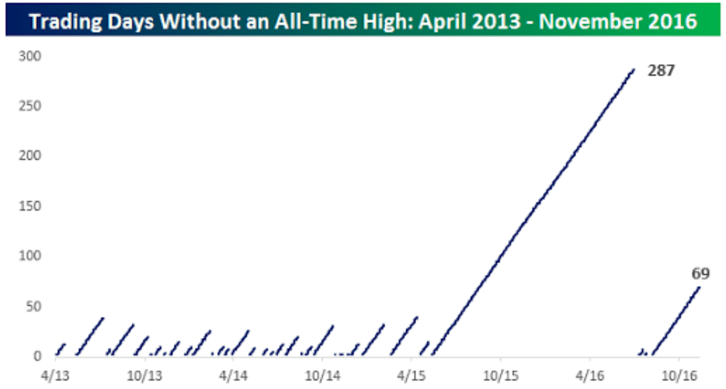
The graph I prefer to use these days is the following:
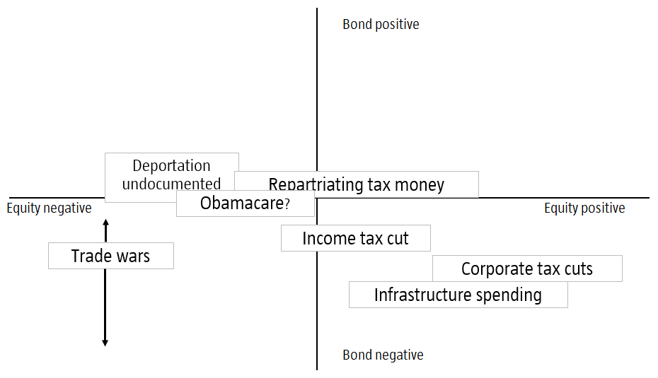
Source: Robeco
This graph shows a variety of the Trump’s most ambitious plans as stated by him over the election campaign placed in a diagram that shows the impact on financial markets. On the horizontal axis is the expected impact on equity markets (left negative, right positive), with the vertical axis representing the impact on bond markets (high positive, meaning lower bond yields, low negative). Of course there’s plenty of room for discussion on how the various policies are placed, as the market reaction will depend a great deal on the specific substance of his policies, and we currently know very little about that: we don’t even know which of these measures gets the highest priority.
Much depends on the details
Trade is a great example, with the specific substance having significant impacts. If Trump only talks tough on Mexico and China, it will all be a storm in a teacup. However, if he decides to act on his words, and characterizes China and probably Germany as ‘currency manipulators’, there’ll be turmoil: the Chinese will likely decide to accelerate their selling off of US Treasuries, with all the consequences that that entails for financial markets.
What is striking in any case is that although Trump’s policies have both positive and negative elements for equity markets, it is very difficult to come up with a positive narrative for bond markets. This also straight away explains why US bond yields rose sharply after Trump’s victory, though equities barely flinched. In the case of equities, the whole thing depends on the direction of travel taken, and as long that is unclear, markets have taken a cautious (but positive) attitude. I’m not really a believer in that pragmatic route – I’ve worked in financial markets long enough to know that you sometimes need a lot of patience before you’re proven right. Timing is everything and it seems that uncertainty is not yet severe enough to trigger a negative reaction on the markets.
New record
But leaving that aside, I wanted to talk here about the new all-time high, as that is the key feature of this week’s graph. This graph is as static and straight-lined as the real market is volatile. What it shows with its diagonal lines, is how long it took the US market to reach an all-time high over the last three years. At some points, it took no longer than a few trading days (2013-2015), but as the graph suggests it can also take somewhat longer. By the way, this graph illustrates that a new record is something that happens with some regularity, but this is strongly dependent on the relatively short timescale we’re looking at here. Taken from 1930, the graph looks like this:
Source: Robeco, Bloomberg

The last small blip in this second graph corresponds with the 69 days in the first graph. From a slightly different perspective, such a graph suddenly looks a lot different… The large diagonal line at the beginning of the graph is of course the market correction that occurred during the Great Depression: in that era they had to wait till 1954 before taking out the peak of 1929.
And in the Netherlands? I still remember vividly the AEX in the year 2000 fluctuating around 700, while these days we’re stuck hovering somewhere around the 450 mark. No new all-time high in 17 years: shit happens. If I add the Netherlands (red line), the graph looks as follows:

The critical equity investor will interject at this point that investing in stocks and shares also generates a dividend return, and if you include that the AEX does in fact rise above the levels of 2000. And that is indeed correct: in May 2015, the AEX total return index did reach a new all-time high of 1029. Not long after that, however, the index once again dipped below 1000 and is still trading at more than 5% below that record. Whether we are likely to rapidly close that 5% gap largely depends on Trump’s policies moving forward. As a small and open economy with a current account surplus of 8% of GDP, the Netherlands is of course not exactly going to benefit from an escalating trade war with the US…
