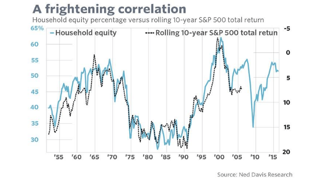
People sometimes say it’s difficult to predict what the stock market will do. Well they’re wrong: this graph shows that we could all make it a lot more straightforward: by just using one indicator! But can we?
By the looks of it, this chart is simple and straightforward: two lines almost moving in unison. Having said that, it is somewhat more complicated than it appears at first glance, so some explanation is required. The turquoise line that relates to the left axis is an estimate of the proportion of their capital that US consumers have invested in equities. It shows the value at any one point in time, which is why the line runs right up to 2016. The black dotted line shows the average ten-year return that you could have generated by investing in the S&P 500. This is on the right axis and it’s inverted: the higher your return the lower the line. Given that we are not yet completely sure what your ten-year return would be if you bought stocks in 2007, this line stops in 2006.
So there is a significant time difference between the two: the turquoise line is a snap shot of the present, while the black line is a glimpse into the future – more of a prediction. As an example: you knew that 60% of Americans invested in equities in 2000, but you have to wait another ten years to establish that their return was -3%. Given that the two lines are remarkably close together, the turquoise line could be regarded as an indicator for future performance. The rule here seems to be: the more households that invest in stocks, the lower the returns in the future will be. That may seem logical: if everyone has already bought into the market, there are fewer new buyers to push stock prices still higher.
Improbable
What is not logical, improbable actually, is that this simple percentage should be such a good indicator for what the market is going to do. Not only does it predict the bigger movements – high returns in the 1980s and 1990s, less impressive performance in the years that followed, but it also seems to accurately follow movements on a quarterly basis for the next ten years. If Americans invest less in one quarter, in the ten years that follow we see higher returns – just like that! But if the percentage increases in the next quarter, the results in the following ten years are lower. Partially thanks to its amazing ability to predict these shorter term swings, this is the most solid indicator there is, at least that is what its inventor claims.
How can this be possible? Such a simple variable, that has such a fantastic ability to predict – there must be a catch.
Too good to be true
And yes there is: it’s too good to be true. The numbers are correct, the relationship between them is too, but we are having the wool drawn over our eyes. It all boils down to the calculation of that percentage figure: that figure is not published by an official bureau of statistics, but buy the creator of this indictor himself. He not only carefully explains how he arrives at these figures; he also thoughtfully provides a link to the Fed database where you can down load the data yourself (http://www.philosophicaleconomics.com/2013/12/the-single-greatest-predictor-of-future-stock-market-returns/). Full marks for being both open and clear. It’s rather a detailed explanation, where a number of assumptions are made to arrive at the percentage in question. Some criticism could be made of these assumptions, but that isn’t the main problem. The real issue lies with the fact that he uses the level of the S&P 500 to calculate the percentage.
And there lies the secret behind the improbable accuracy of his predictions, because it means that the level of the S&P 500 is included in both the turquoise and black lines. Temporary blips (a notorious part of investing in equity markets) appear in both lines and you see many of them occurring at exactly the same time. But that has nothing to do with forecasting: the same volatile data is being used in both elements. And as soon as you have one variable that more or less tracks the larger movements, you very quickly end up with a high level of ‘accuracy’ in your predictions.
To give you an idea of how important this double factor really is, I have also played around with data in the past. The data set I created in about five minutes I appropriately named the CRAP indicator, an indication of its non-existent value. The CRAP indicator is the level of the S&P 500 divided by the total number of existing jobs in the US, then divided again by the CPI figure. It’s gibberish: a price index (S&P 500) combined with an absolute figure (number of jobs) and then aligned with the current situation (corrected for inflation). It’s meaningless, but if I plot this CRAP indicator against the ten-year return…
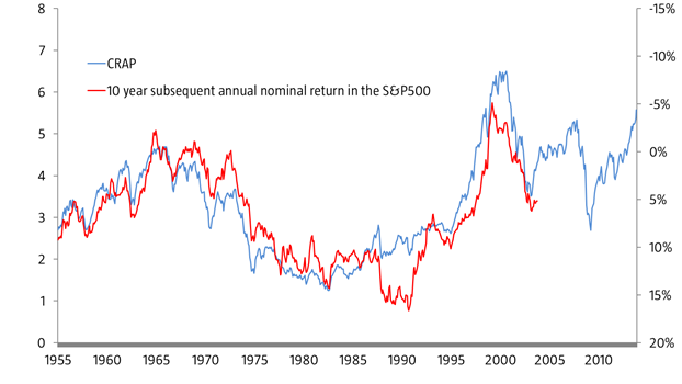
It’s unlikely that the CRAP indicator could predict future returns, quarter after quarter, isn’t it? Well, eh, no, actually. The movement is caused by exactly the same criterion: the volatility of the S&P 500. My CRAP indicator (on a monthly basis) has an r² of 0.71 and thus lags the predictor outlined above, but that doesn’t tell me all that much: my indicator is evidently ridiculous and yet still seems to work amazingly well. We seem to be caught up in a circular argument and it’s one that even makes CRAP look good.
This doesn’t mean, by the way, that I am implying that the level of stock holdings does not have some impact on future returns. But that its prediction level is 90% is utter nonsense: in the same way that the CRAP indicator is more than 70% ‘accurate’ – something we have demonstrated to be ridiculous.

Pingback: Best of the Web: 16-11-30 nr 1568 | Best of the Web