http://www.frbsf.org/economic-research/publications/fedviews/2016/october/october-13-2016/
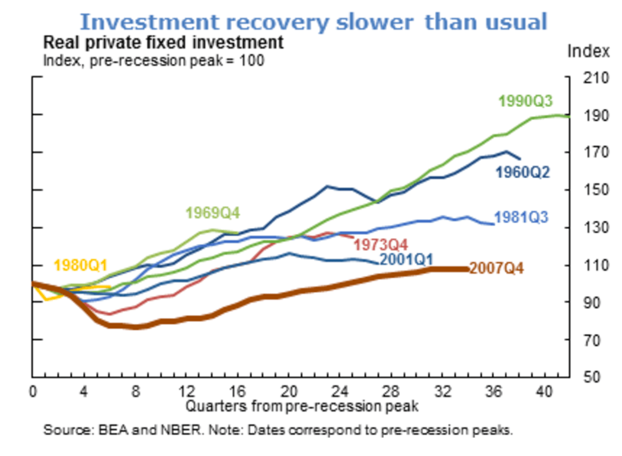
These days, economists like myself have to be pretty well-balanced if we are to avoid being depressed all the time. The pessimism in our field is pervasive. High debts, disappointing growth, inequality, aging: the list of economic problems is long and distressing. Even the US economy is no longer what it once was, as shown in this week’s graph: current investment levels are lagging far behind those seen in all previous periods of economic expansion. Because investment determines domestic productivity, it’s safe to say that in addition to not boding well for the short term, this directly affects the growth potential for the next few years.
But is it really that dire? The graph comes from the Federal Reserve Bank of San Francisco, so I don’t really question the reliability of the figures. Though I still see some weak points. What exactly does the graph above show? Total investment growth in the US economy since 1960, split into several different time intervals. The overall historical trend looks something like what is shown in graph two below:
Real investment in the US economy
Source: Robeco & Bloomberg

In the first Federal Reserve graph, the trend is broken down into various time intervals and uses the NBER definition of a US economic cycle. Essentially, the black lines in the second graph are the starting points as they show the peak of each expansion phase. That’s all well and good, but as this graph clearly shows, the dip occurring between 2007 and 2009 was the worst in that period. Of course, it’s not so surprising to see the biggest percentage drop occurring during the worst recession of the last 80 years. In other words, the thick red line in the first graph (2007 Q4) takes the sharpest dive, so recovering from such a huge blow will understandably take longer. While the graph’s title refers to investment recovery that is slower than usual, the graph mostly shows that the drop was sharper than normal. If you want to show the recovery, I think the trough is a more realistic starting point than the peak because you then really see the recovery phase.
And then it would look like this:
Investment recovery no slower than usual
Source: Robeco & Bloomberg

Here, the red line in graph one (2007 Q4) corresponds to the black line in graph three. I know it’s nothing to get too carried away about, but it actually doesn’t deviate much from the average pattern of the last 50 years. So ‘recovery’ is no slower than usual: returning to the previous level just took longer after such a sharp drop.
All the same, I won’t deny that GDP growth has been weak and recovering more slowly now than in previous cycles. That’s easy to see if you look at the changes in total GDP, rather than just investment, as shown in the third graph. This leaves little room for doubt: the US economic recovery is much more sluggish than in previous cycles. The black line is considerably lower than the other lines and the slope is consistently less steep than in previous cycles.
By contrast, GDP recovery was extremely sluggish
Source: Robeco & Bloomberg

And that made me wonder: if GDP as a whole is recovering much more slowly than before as shown in graph four, while investment (which makes up part of that GDP) is picking up at an average rate, how has investment changed relative to the GDP? In other words: given the weak GDP recovery, wouldn’t you actually expect the black line in the third graph (investment) to be the one that rises the least? In short: in relative terms, what is the change in the investment ratio (I/GDP)? And hey presto!
Investment ratio recovery is at the top of the range!

Source: Robeco & Bloomberg
As it turns out, as graph five shows, the current investment cycle has never risen as sharply as in this recovery phase! In absolute terms, it may well be that investment levels are modest, but in relative terms, we have actually reached a high. Mind you, since it’s ultimately about the overall growth, this relative high doesn’t help us much. Above all, however, I want to point out that whether or not investments are disappointing, seems to depend a lot on how you look at the data. And it’s worth noting that these days, we tend to go for the negative interpretation.

Pingback: Best of the Web: 16-11-03 nr 1549 | Best of the Web