https://www.bespokepremium.com/think-big-blog/unemployment-rates-by-state/
Today’s graph shows the developments on the US job market. But what would it look like for Europe?
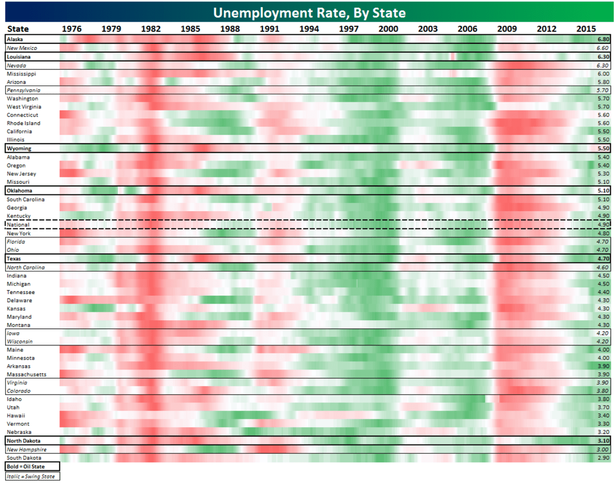
It’s hard to really look at this graph because it’s too crammed with data. For each of the fifty states, the monthly unemployment rates dating back to 1976, plus the national rate, are shown. In total, this one graph has nearly 25,000 data points. With all that data, you’re bound to lose sight of the details, but maybe that’s the whole point. Rather than zeroing in on a particular regional development, you mainly see the overall trend.
The periods of high and low unemployment are shown in red and green, respectively. It gives us a good idea as to the severity of the recessions in the early 1980s (note the classic double dip) and in 2009, and how marginal the recession actually was around the time the dot-com bubble burst (2000-2001). In addition, we are struck right away by the high degree of synchronicity: red and green appear at the same time, the key difference being the intensity. For example, if you look closely, (and you might need a magnifying glass to do it) Alaska, Louisiana, Hawaii and North Dakota did a fairly good job of bucking the trend in the case of the 2009 recession, but nowhere do you see unemployment turning green in one state and red in another.
European data
So then I started wondering what this graph would be like for Europe. Of course, going back to the 1970s, the data would be nowhere near complete for every country (there was no Czech Republic and Germany was still divided in two) and each one may have defined unemployment differently, but after some searching, I did find one source with quite a bit of data: Eurostat. In spite of the historical gaps, the core Eurozone countries and their larger neighbors are sufficiently well-represented in this graph to give us a clear idea of the unemployment situation. The black line indicates countries belonging to the Eurozone, which have obviously increased somewhat over the years.
Source: Eurostat, Robeco

A monetary union can only remain stable if economies ─ and thus unemployment rates ─ are in sync. However, they are much less so than in the US graph. Remarkably, Germany shows a countertrend. From 2003 to 2007, it becomes increasingly red (‘the sick man of Europe’), where most of the other countries show up green or white. Around 2009, just as things got difficult for the others, Germany slowly but surely turns green and then increasingly so. This graph also nicely illustrates all the drama of the last 20 years: the good times from 2000 to 2010 in countries like Ireland, Spain and Greece, followed by bright crimson. With an unemployment rate of 23%, Greece is still deep red.
If you look closely, however, Luxembourg’s red is now at its darkest. Did we miss the Luxembourg crisis? Not exactly. Each country has its own color ‘settings’. For Luxembourg, intense red means 6% unemployment, the highest rate recorded in the last 33 years, while for Greece, this same figure would be dark green. To highlight the differences, here’s a graph in which the color distribution is the same for each country.
Source: Eurostat, Robeco

For Greece and Spain, the red becomes so intense (both countries have unemployment of over 26%!!), that the rest of the red pales in comparison. What’s striking about this graph is that the fate of the countries seems to structurally follow widely diverging paths. Spain, Cyprus and Greece suffer from chronic high unemployment, so they are almost always red, while the Netherlands, Austria, Denmark, Norway and Luxembourg stay relatively firmly in the green. And once again, in contrast to the US, the countries are clearly not in sync. So it’s no wonder there are serious doubts about the Eurozone’s long-term viability. For more about that, just listen to Joseph Stiglitz, who will be in the Netherlands this Friday to present his new book, ‘The Euro: And its Threat to the Future of Europe’.
