http://www.leutholdgroup.com/stock-market/articles/2016/09/08/semi-annual-checkup
The development of the stock market can be shown in many different ways. Today we show it in the form of straight lines…
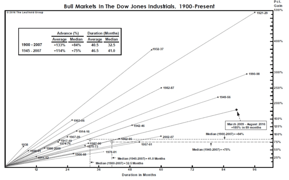
It’s not pretty, this graph. The lines possess a severity that you normally only see in a scientific publication, the words are illegibly small and you really have to do your best to work out exactly what it is you’re looking at. Although the title gives us a strong hint, at first it’s not entirely clear for everyone how this array truly represents the bull markets in the Dow Jones. And yet it’s actually a nice graph, which on balance turns out to be not that complicated after all.
The starting point is the historical development of the Dow Jones since 1900, with the intervening 116 years chopped up into blocks. Specifically, this graph looks at the periods in which the Dow Jones trended upwards, also known as ‘bull markets’. Given that the market rarely rises in a straight line and takes a little step back now and then, the definition of a bull market is qualified as a period in which stocks don’t fall more than 20% from the previous high.
If the market falls ‘just’ 19% and then recovers, the bull market is said to be intact, but if it breaches the 20% threshold then the bull takes to its heels and is replaced by the bear (a ‘bear market’). If the market then bottoms out and once again exceeds 20% from the trough of that specific bear market, the bull comes raging back into view. Looking at it like this, we can chop the last 116 years into chunks, allowing us to see how long the bull markets lasted and what kind of returns they actually generated. And that’s exactly what’s happening in this graph: the duration of the rally is given on the horizontal axis (in months), the return on the vertical axis. The points then show the different periods of positive returns. For those who have to squint to read it, these points lie between 25% (more or less the smallest bull market imaginable, given that the threshold is 20%) and 500%. That 500% was the rally in the 1920s – no accident that we call it the roaring twenties!
Recreating and updating the chart
To address the criticism regarding the opaque layout, I’ve recreated the same graph, but this time for the AEX Index – Holland’s pride and joy. No severe lines this time, and no tiny letters: it’s just simple and big. The history is of course a lot shorter, but the result is still very similar. Notably, our top score also comes out at 500%, and that’s despite the AEX data only harking back to 1984. Our topper took place in 1991–98, the long run-up to the major dot.com bubble, which was interrupted – briefly – in 1998 by unrest relating to the Asian crisis.
As an aside, let’s hope that the roaring twenties in the US doesn’t serve as a blueprint for the development of the Dutch market: it took another full 25 years before the Dow Jones managed to top out on its previous peak of 1929. If that were to happen here, it would be 2025 before we closed at 700 once again. By the way, we’re looking here at price development only, so dividend is not factored in: if you count dividend, then we took out the 2000 mark long ago.

An interesting exercise now is to see how the graph would look for the bear markets. For the AEX, we see the following:

The same points, but then to the downside. However, one key difference is that the bear markets are usually much shorter in duration than the bull markets: you can lose half your investment in just six months, whereas a doubling of the market generally takes a good two years. Though it’s probably a good thing that the pain usually doesn’t last for long, it is a particularly bitter pill to swallow: all those returns that you patiently accrued over the years evaporating in just six months…
But there we go: nice graph. Poorly formatted, though.
