Two months ahead of the US elections, the stock markets have apparently long since decided the outcome.
At least, that’s the claim made in the blog with this graph. So the race is already won and we can start focusing on other things. Out of curiosity, I looked at how they could draw that conclusion based on this one graph…
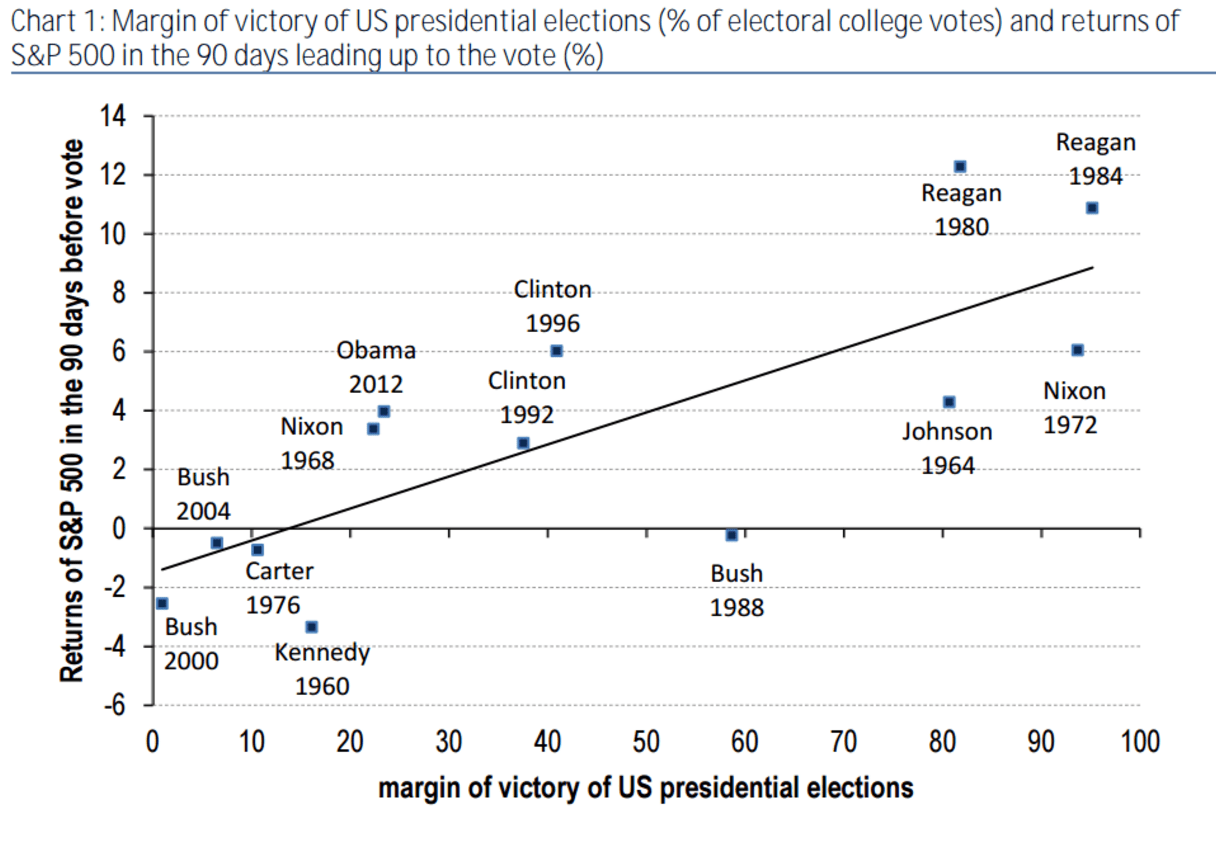
It shows how stock market behavior relates to election results. And for a change, it does not even look at how the markets react to the result itself, but instead focuses on the trends in the 90 trading days before the vote. The results are shown on the vertical axis. The horizontal axis shows the margin of various presidents’ victories. As it turns out, there is a strong connection between the margin of victory and share price gains recorded in the run-up to the election. A result that’s both gratifying and in line with what our intuition tells us: the stock market is allergic to uncertainty, so the more clear-cut the victory, the better for share prices.
On closer inspection, however, one coordinate appears to be missing: the 2008 results. Clearly, this was left out due to the ‘mere’ 20% drop recorded in the 90 trading days before Obama first won the presidency. Its inclusion would have immediately rendered the graph useless and ruined the entire thing. At least they were conscientious enough to mention their omission and the graph tries to make a link between upheavals and stock market trends, so actually, I’m willing to forgive them.
An interesting graph, showing our aversion to uncertainty: let’s hope Clinton wins in a landslide because it will be good for the stock market. So far, so good, but the graph’s makers then reverse the relationship: because it has already risen 4% since early July, the market is banking on a landslide victory for Clinton. At that point they cite the Iowa Electronic Market, a platform where you can ‘trade’ on election results, among other things. What they seem to imply is, since Clinton is doing so well there, it’s clear why the stock market has gone up.
Hmmm. Let’s focus on the bookies, rather than the polls and ask ourselves, when did we last hear this? Wasn’t it before a referendum, somewhere in the UK?
What the graph shows is a reasonably close relationship between the election results and the 90 trading days before the elections. But that in no way proves that during that time the stock market is a reliable indicator for the margin of victory. If it was, then the US markets would have slipped considerably in the last few days: not only because the most recent polls show Trump slightly ahead, but also because Clinton’s lead on Iowa Electronic Market has taken a bit of a hit. In fact, the last few days saw US markets rise steadily.
Looking at what the market has done, I would have been more inclined to say that so far, it has completely disregarded the elections. Whereas the pound sterling reacted nervously to new Brexit polls, I don’t anticipate either the dollar, or the markets responding much if a new polls show Trump once again gaining ground. It seems to be more of a case of: ‘I’ll believe it when I see it’. And so we will have to wait until 8 November to plot a new point on the graph.
