http://uk.businessinsider.com/us-economy-finally-getting-good-news-2016-7
The US economy seems to be recovering from a long period of disappointing macro numbers. Correct or nonsense?
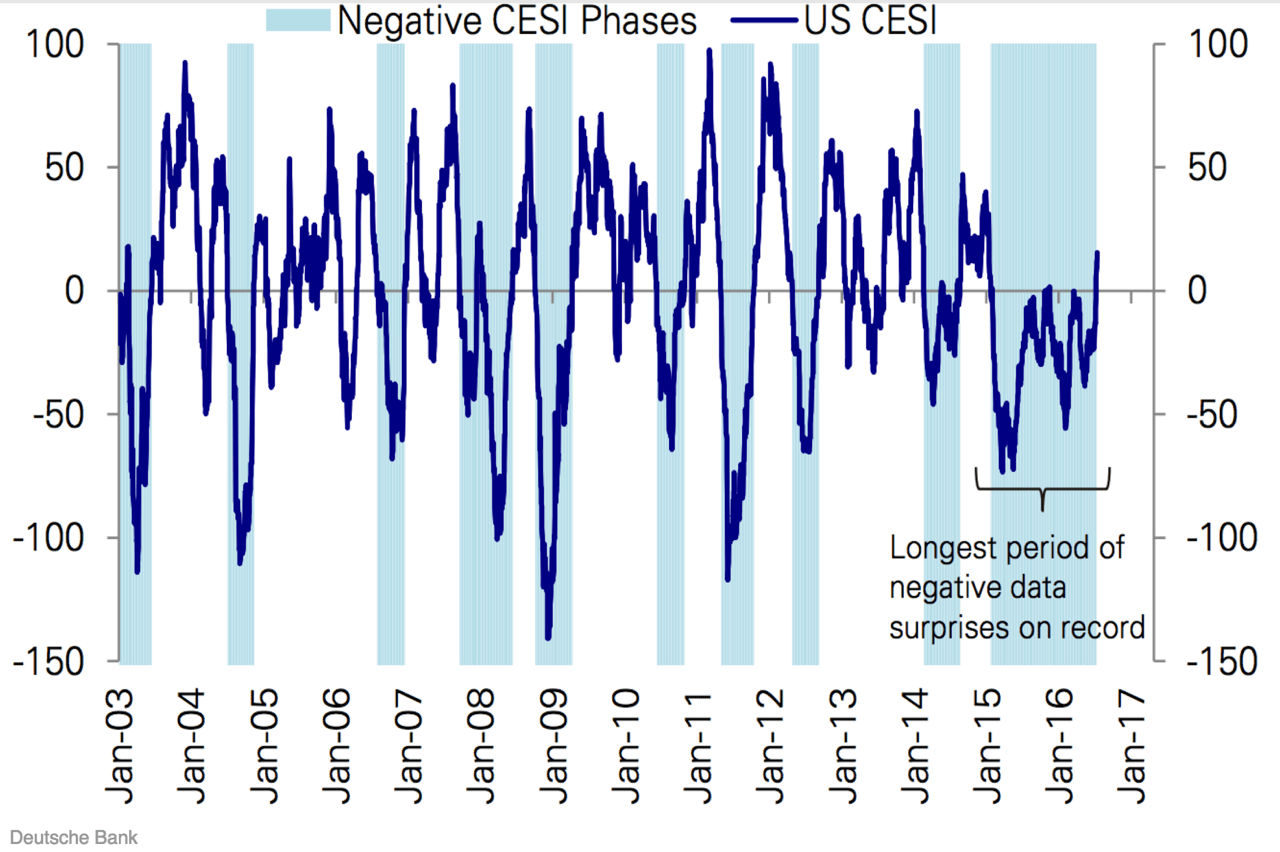
This graph is basically clear enough. We see a picture of something that looks a lot like the waves of an economic cycle, with periods of higher positive outliers alternated with periods of negative values. Another notable aspect – albeit simply because it says it in the graph – is the block at the end: the long period of negative data. From January 2015, the data series dives into negative territory and then gets stuck there for 18 months. And now, at last, a reversal into positive values. The scope of the graph: the US economy has at last managed to pull itself free from a long period of weakness.
That’s clear enough, but at the same time it begs an important question: what data are we actually looking at here? It is a series that at first glance appears to have roughly the same amount of negative and positive trends (I’ve checked: Precisely 50%), but that is also very volatile: on average, the index dives into negative territory at least once every twelve months. Not a single macro-data series (unemployment, GDP, producer confidence) is as volatile as this, so what’s going on here?
The graph shows the course of the Citi Surprise Index. This index doesn’t look specifically at a single macro number or a specific sector, but shows all the key data points announced in relation to the US economy. The focus here is not so much whether unemployment has fallen, or that the US economy grew by 3% in the second quarter. No, we’re looking here specifically at the degree to which the numbers that are announced are weaker or stronger than had been expected. This is not done using individual forecasts, but by considering the predictions of a group of analysts, the so-called consensus expectations. This consensus is carefully kept up to date by news agencies like Reuters and Bloomberg for the key numbers, such as GDP growth, durable goods factory orders or jobs growth. The series therefore gives a good indication of whether the numbers have, on balance, been weaker or stronger than expected over the previous period.
In theory a very useful concept. If you look at financial markets, for instance, then you’ll see the biggest outliers usually occur at the point at which something unexpected happens. Stronger-than-expected retail sales numbers, for example, or an unexpectedly weak job-market report has a much larger impact on the market than an announcement that was more or less in line with expectations. You can also see this to some degree if you compare the Citi Surprise Index with developments in bond and equity markets (see below). The relationship is a lot stronger, by the way, in the bond market than in the equity market. Equities are apparently less affected by macroeconomic data and are probably more focused on earnings numbers.


But before you get the idea in your head that you could use this to benefit from bond markets: that’s not as easy as you might think. You won’t benefit unless you can predict not only consensus expectations, but also what the real numbers are going to be.
And that brings us neatly to one of the shortcomings: there are two moving parts. The consensus and the actual figure. A disappointing Citi Surprise Index might be down to weak numbers, but might just as well be down the impact of (over)optimistic expectations. For instance, a report of 200,000 new jobs can be at one point a major positive surprise (if no new jobs had been expected), but at a later date a major disappointment (if 400,000 new jobs had been expected). So it doesn’t really say much about the level of the underlying growth, as clearly illustrated by the following graph:

What this graph clearly shows is that the relationship between the Citi Surprise Index and the growth of the economy is not particularly strong. At the lowest point of the recession, the surprises to the upside had a massive impact, and in 2015, too, at the beginning of a very long period of disappointments, there was really not that much wrong with economic growth: in the first half year, growth was above a respectable 2.5%.
So it’s true that we now appear to have escaped from the longest period of disappointing numbers. But you can also turn this on its head: we have at last escaped from the longest period in which the consensus persisted in overoptimistic expectations. And that doesn’t really say a great deal about underlying growth and earnings expectations.
