http://uk.businessinsider.com/goldman-sachs-on-china-debt-boom-2016-6
Today a great graph that puts rising Chinese debt into an international and historical perspective.
At first glance, today’s graph seems to be a simple historic overview of the development of debt in a number of countries. Debt is given on the vertical axis and includes not only government debt, but also the debt levels in the private sector. With just a cursory look at the graph, you’d likely conclude that the horizontal axis is therefore a time-line, a suggestion that is further reinforced by the fact that “WW I in Europe” is the first text block that you see in the graph. If the First World War’s on the left, then the present will be to the right – not an unreasonable assumption.
Not unreasonable, but still wrong, or at least not entirely correct. The horizontal axis is actually not a time axis, but indicates the level of development of the different economies. Specifically it looks at GDP per capita, which is a generally accepted benchmark for showing at which stage of economic development a country finds itself. For example, a country with a per capita GDP of up to 1,045 dollars qualifies as a less-developed country. A country with a per capita GDP of between 1,045 and 12,746 dollars is a so-called middle-income country. Above that are the developed countries. These thresholds are otherwise arbitrary: there is no specific reason why a country with a per capita income of 12,745 is really any less developed than a country at 12,746. This division does have consequences for the support a country may receive from the World Bank, but we’ll leave that aside.
So what this graph shows is the development of the debt relative to the stage of development in which a country currently finds itself. Given that most countries shown in this graph have become more prosperous over the last 100 years, there really is to some degree an element of time: all lines begin on the left and end on the right.
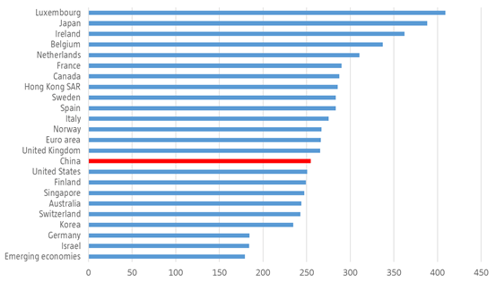
The reason I think this graph is such a great example is best illustrated if I first show a graph with the current debt levels of a number of countries. These are as follows:

Source: Robeco, IMF
If you look at this overview, a country such as China doesn’t really stand out at all: it seems to be a sort of middle-of-the-road job, nestling between the US and the UK. However, if we look at the first graph, its exceptional position clearly does come to the fore. Certainly China doesn’t have especially high debt levels versus other developed countries, but if you add its level of development, you’ll see that China really does deviate from the norm. Or, if we just grab the title of this graph: China’s debt buildup is unusual for a low/middle-income country in peacetime.
Although it indeed looks concerning, you should ask yourself straight away whether or not this is a somewhat distorted view. Is it simply that less developed economies usually also have less reliable statistics and therefore do not appear in the graph? All those African countries that had payment problems in the past, are they included in this graph? And where is Thailand? During the Asia crisis at the end of the 90s, many Asian countries got into problems, with Thailand being the domino that started the collapse. Thailand had debt levels of 190% of GDP, with a per capita GDP of roughly 3,000 dollars. If you look closely, you’ll see a light-gray line in the text block of ‘WW I in Europe: is that Thailand then?
A key reason why the debt of developing countries is usually lower, is the fact that the banking system in those countries is underdeveloped. A large portion of the population is often too poor to save money, which explains the absence of a banking sector. Without banks it’s also clearly difficult to get into debt, at least in the formal economy. If that option was to arise at an earlier stage, then many developing countries would have much higher debt levels: it’s those economies in particular where there are plenty of profitable projects to be financed, which – contrary to what happens in developed countries – contribute to higher growth. Given that China has beaten its own path in terms of developing the economy (there are more high-speed trains in China than in the US), and where in contrast to other ‘developing countries’ savings levels are high, it really isn’t that strange that debt is rising at a much earlier stage.
Having said that, this graph from The Economist also gives us some food for thought.

Whatever the case: great graph. And let’s not even mention Japan …
