http://www.factorinvestor.com/blog/2016/6/1/a-factor-investors-perspective-of-the-economic-cycle
Investors like simple messages. Unfortunately, in the real world such simplicity is rare.
For all the years I’ve worked in the financial sector, I’ve seen many pictures that try to simplify things for investors. Investing with the cycle, for instance. The idea is easy to grasp and appeals to our imagination: various investment categories or styles do better in different phases of the economy – well that’s the concept anyway. Buy commodities if you’re just emerging from a recession, for instance. Commodities are early cyclical and companies in that sector are the first to see their profits and sales recover. And of course their share prices. Or buy government bonds at the point at which we enter recession, as that’s the moment everyone’s fleeing to safety. All projected on a perfect sine wave that illustrates the development of the economic cycle. Simple and it feels like it’s easy to understand, so it’s not surprising that we see it repeated so often. And at Robeco, too, I remember us using it in the past.
Today’s graph comes from the same stable. The blue line shows the simplified wave of the economic cycle, surrounded by the best investments in each phase of the cycle. However, this graph deviates from the classic ‘buy commodities, buy government bonds’ narrative in the sense that it really only looks at equity markets, specifically factor investing styles. Factor investing? Yes, factor investing. Factor investing relates to equities with certain characteristic properties that generate higher returns than the market as a whole over the longer term. Scientific research demonstrates that you will enjoy a better risk-return profile if you consistently invest in low-volatility (low vol) stocks, or that you generate healthier returns on average by always buying the previous month’s best-performing stocks (momentum). Small companies (smallcap) or enterprises with low valuations (value) also appear to do better over the longer term.
By the way, the term ‘factor investing’ is not patented, which means it is overused for various different investment styles, even where there is no scientific support for it. I just wanted to mention that, as this graph contains factors that I would not consider to be factors. Value I recognize as a factor, but not Shareholder Yield (how much companies give back to shareholders in the form of dividend and share buyback). But I’m no expert in the field of what exactly is or is not a factor: I’m just warning you that the term is pretty popular these days. For further background, go here or here.
Thorough study
But if you think this graph is just arbitrarily thrown together based on gut feeling, you’ll be very wrong: the selection is based on a detailed analysis of the US market since 1964. The phase of the economic cycle is based on the timing of the NBER. This means the market is not only divided into factors, but also into themes: this also directly explains the existence of Expensive Value, the more expensive segment of value investments. If you study the graph, you’ll see straight away that this is not exactly the area of the market in which you should be active, as before, during and after a recession Expensive Value falls within the category Avoid. They could have defined expensive smallcap in the same way, too.
Thorough work, clear presentation, pretty pictures, and it adds a new element (it’s all about factors!): so it’s a great job. However, the downside is that though this is a reasonable analysis of the past, it has little value for the future. The point is, you can establish with great precision when a recession started in the past (that’s what the NBER is for in the US), but that is less straightforward for the future. We can now see precisely that the last recession in the US started in December 2007, but that was only officially established by the NBER in November 2008 … The problem is that the timing of the recession is quite important: in this study, the pre-recession phase is simply fixed to 12 months before the official start of the recession, so you need to predict a recession another 12 months before that …
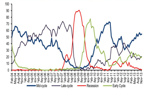
Anyone who thinks that the timing of the different phases of the economic cycle is easy to estimate, should take a look at the next graph for a giggle. This shows the outcome of a survey conducted quarterly by the Bank of America among professional investors that asks which phase of the economic cycle we are currently in. Recession, that’s not hard to spot, and the recovery is also fairly easy to identify, but that’s the point at which it gets all vague and opinions are divided about which phase of the business cycle we are actually in. The graph stops in 2013, but I’ve got a suspicion that the red line (recession) rose strongly in early 2016 and then started receding again. Regardless of how well the economic cycle is shown in a sine wave, the real world turns out to be a lot more unruly, with mid-cycle corrections and false signals.

http://www.businessinsider.com/current-position-global-economic-cycle-2013-11
To reinforce that point somewhat for a laugh, check out this graph that shows the ‘economic cycle’ of Japan. The gray areas indicate when the Japanese economy was in recession. There’s no sign whatsoever of a pretty sine wave, with the recessions following each other in such quick succession that the pre- and post-recession periods would even overlap if you held to the 12-month period used in the study. A ‘pure expansion phase’ last occurred in the period 2001-2006. It’s a smart investor indeed who knows how to distinguish the recession from the expansion in such a ‘cycle’…

Source: Bloomberg and Robeco
Aside from the technical problem of timing a recession, it is also quietly assumed here that each new recession would be more or less the same as the last. I can understand that a recession resulting from shortages on the labor market and rising inflation could lead to a very different market dynamic than a recession resulting from a bubble in the housing sector.
Although that’s not really a criticism of this specific study, it is a general shortcoming of the simple ‘investing with the cycle’ approach. It looks impressive, but in the end it’s very simple.
