https://www.janus.com/bill-gross-investment-outlook
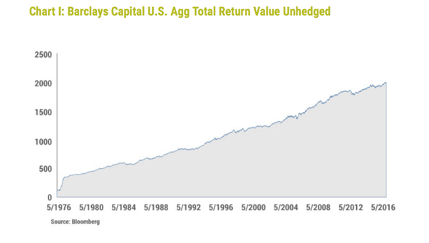
The subprime crisis, 9-11, the dot.com sell-off, the Asia crisis, the crash of 1987, the oil crisis, even the Major Correction on bond markets in 1994 (who doesn’t remember that?): you won’t find them in this graph. The best investment ever?
This graph is striking, to put it mildly. It shows the development of returns that a US investor would have earned if he had invested in the wider US bond market. Or more specifically, if he had invested in the broad index compiled since 1976 by Barclays that covers the entire universe of US government bonds, corporate bonds (with limited credit risk), and government agency bonds, but also includes more complicated investments, such as Asset Backed Securities. As an aside, the latter play a less important role in the whole.
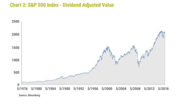
I came across this graph on the monthly blog by Bill Gross (highly recommended!), the renowned US bond investor who made the switch last year from PIMCO to Janus, albeit with a great deal of fuss and somewhat chaotically. He is now a bond investor, but even he admits to being surprised by the development of this index. So at first glance, this graph does not reveal a single crisis. On balance, you would have realized a 7.5% return, with almost no single period of negative returns on a 12-month basis, according to Gross. By comparison, Gross then includes another graph on his blog that shows the price development of the S&P500, to show just how volatile equities have been. The same result, but much more volatile.
The strikingly stable and positive return is a sum of two points. The first is the gradual decline in the underlying capital market rates, since 1981, of no less than 16% to the current 2%. The value of the underlying investment in bonds increases as the interest rate decreases. A second reason is that bonds function as a safe haven at moments of crisis. Subprime and dot.com were actually positive for bonds.
Fact-checking Gross
And yet, is this true? Let’s start with the first graph: that’s correct, mostly. Alert readers will already have asked themselves why that index makes such a strange leap in 1976, and that jump is indeed an error. Exactly why, I don’t know, but the correct development looks like this. I’ve added an extra line to also test Gross’ second claim whether you would have realized a negative return at any point.
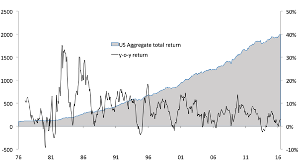
As stated, this graph deviates at the beginning, but that doesn’t really affect Gross’ narrative: no crisis visible, 7.5% annual return. The black line then gives us the year-on-year change, demonstrating that the moments of loss are indeed limited: the biggest loss amounted to -9.2%, which you would have faced in 1979-1980.
Less impressed
But I’m less impressed with what Gross then does by giving us the picture of the S&P500. Although he doesn’t waste any more words on this, the graph does give rise to the suggestion that you would have earned roughly the same with an investment in bonds as with the S&P500: both indices begin at 100 and end at around 2000. The term ‘dividend adjusted’ only contributes further to this suggestion: any other person would have called it the ‘price index’, but by adding the term dividend, it looks like there has been a correction for dividends. But that is actually not the case at all: this is the simple price index of the S&P500
The graph that shows the total returns of an investment in equities (so with reinvestment of dividends received) looks as follows:
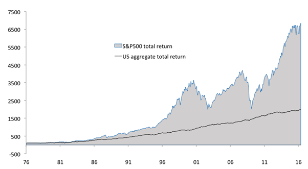
Much more volatile, that’s for sure, but at the same time also much, much more profitable.
However, Gross doesn’t show these graphs to sell ‘his’ investment category. Indeed, after reading the blog, it’s clear that the 7.5% of the past 40 years is exactly that: past – it’s not coming back. According to Gross, this improbable result could only be replicated if capital-market rates fell over the next 40 years to -17% …
