http://uk.businessinsider.com/venezuela-collapse-protests-oil-headwind-2016-5
What has been the major theme on the financial markets over the last six months? That’s easy: oil.
Anyone who was able to make sound predictions about daily oil price movements in the first three months of the year, wouldn’t have had to really worry about the Fed, macro figures, or even corporate earnings figures. Equity markets were all fixated on oil prices. The graph below shows just what a dominant effect oil market had on the US equity market. It shows the intraday movements of equity markets (horizontal axis), against oil price movements (vertical axis). The correlation between the two was remarkable: every price movement of USD 1 per barrel more or less resulted in a 1% movement in the S&P 500. If I then tell you that the price of a barrel of oil fell by almost USD 15 in the first two months of the year, it is clear just what an impact this move had on the financial markets. So an accurate prediction of daily oil price movements would have been worth its weight in gold.

Source: Bloomberg/Robeco)
Gold, yes, but impossible too. If one thing has become clear in the last couple of years, it is that predicting the price of a barrel of oil is pretty difficult, and that’s an understatement. It was already difficult enough to make long-term predictions. As far as I am aware, at the beginning of 2015 there was no one who predicted that one year later the price of a barrel of oil would have fallen below the 30-dollar threshold. There may have been people who warned that there was more supply than demand, but it proved to be very difficult to estimate at what level – USD 40, 60 or 30 – the market would reach equilibrium. This was not only because demand (how quickly is the global economy growing and how quickly is the shift to alternative energy sources occurring?) is so difficult to forecast, but the supply side is too. The cost of extracting shale oil fell much more quickly that people had expected (which lead to more supply at every price level), but we were also dealing with a change in Saudi Arabia’s stance (no longer the swing producer to which we were accustomed) and the prospect of Iran returning to the global market as an oil producer.
So if the long-term outlook was far from stable and difficult to predict, this meant the short term was utter chaos. It’s not that easy to ‘switch off’ production once an oil field is up and running. So even if the long term prognosis is not profitable, production can just carry on, at least in the short term. There are also other short-term aspects to take into consideration, such as generating sufficient cash to pay off debt (for example for those US companies active in the high yield market), to win or keep market share (Saudi Arabia) or finance wars (ISIS). If you also include speculation, rumors and production shocks, it is understandable that short-term oil-price predictions ran into some difficulties.
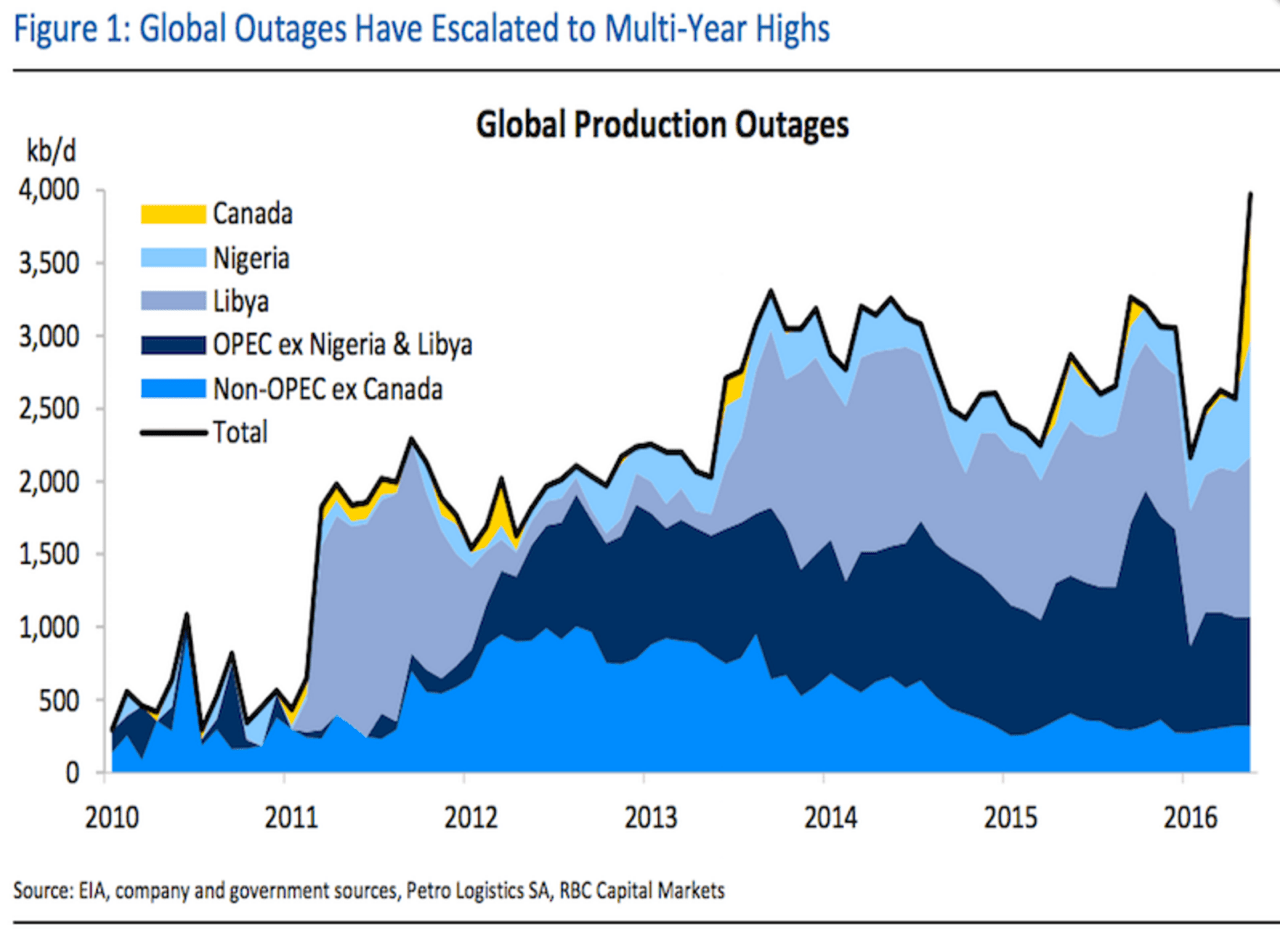
Production shocks
Now, finally, let me come to this week’s graph. Or graphs in fact, as there are two that more or less illustrate the same: production shocks. In contrast to the usual overviews that show total oil production, these two graphs show what proportion of the oil is not produced. Supply disruptions as a result of wars, strikes, sabotage and even forest fires (Canada). The first graph was produced by RBC Capital Markets and shows the supply disruptions of the last few years (from 2010). The second comes from Goldman Sachs and covers a somewhat shorter period, but – on the plus side – also gives an estimate of the disruptions that will continue for the next few months. For what this is worth, of course, because predicting supply disruptions is probably not much easier than forecasting the production itself. Forest fires in Canada: who would have predicted that?
http://uk.businessinsider.com/goldman-sachs-chart-on-supply-disruptions-in-the-oil-industry-2016-5

Nice graphs, but if you compare them, it immediately becomes apparent that they are of relative value only. In the RBC graph, Libya is one of the main sources of supply disruptions (mid-blue color), while in the Goldman graph it plays only a marginal role (red bar). This indicates that you can make the graph look a lot more threatening (or less threatening) by including or omitting certain cases of potential production.
One thing that both graphs show is the increasing level of supply disruption in Nigeria, which is also partly the reason why Goldman argues that the oil price really has already hit its lowest point. This is a shift in opinion given their earlier warning that oil prices could fall below the USD 20 per barrel mark…
