http://uk.businessinsider.com/new-global-economic-order-services-versus-infrastructure-2016-5
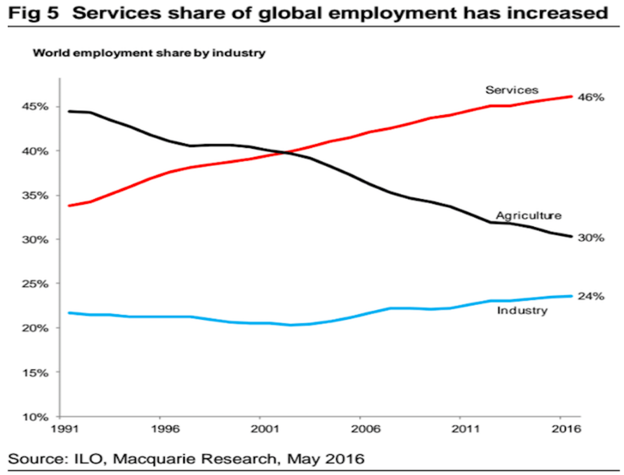
This is a graph that does little to fire the imagination. Just three lines. But it’s still interesting…
There’s not much to it. On the graph there are just three lines and the one at the bottom (blue) seems to be more or less stable. So in fact it’s really just two lines: one that goes up, and another that goes down. Given that the graph gives a breakdown and the three lines add up to a 100%, this means that if one moves higher (the red one in this case) this is a direct result of the other one (the black one) moving lower. The reverse is, of course, also possible: cause and effect are not discussed here. If you strip this back to the bare essentials, you could actually say that it is all about a single line. A rising red line.
This is also really the point of the analyses that accompanied this graph: it was all about the rising red line. This line shows what percentage of total employment occurs in the service sector. And, just for a change, this time we are not looking at US figures, but at employment figures worldwide. What it shows is that an increasingly large proportion of total employment is in the service sector.
The chart is taken from a research report on the consequences of the rising importance of the service sector. For one, worries about the weakness that we have witnessed in the industrial sector over the last year appear to have been overdone, the industrial sector is no longer big enough to push the global economy into recession. It also suggests that future economic cycles will be less volatile, because the service sector is less volatile than the industrial sector. And also that this shift will cause lower productivity growth in the future. In short: pretty important stuff if it proves to be true.
Lower productivity, I can go along with that
Actually I only find this last argument to be compelling: the lower future productivity. Unless the use of robots really does take off, it is quite difficult to make, say, hairdressers or chefs more productive. In fact, how can you even measure the labor productivity of these sorts of jobs? Is it just about the number of meals or haircuts, or is the quality of these more important? If it is quality, how is something like this reflected in the production figures? High quality haircuts? In case of the production of goods, it is easy to calculate the output per worker and to raise it by investing in machinery for example. When it comes to services this is not nearly so straightforward: it is difficult to see how the world’s hairdressers will become 1.5% more efficient on average per year.
But now that lower volatility. If I’m not mistaken, the last global recession from 2008 to 2009 was a pretty volatile affair (the most significant recession since the 1930s…?) and it revolved around the banking sector. Banking happens to be a service sector…Of course you can say that this is the exception to the rule, but people have often signaled the demise of the economic cycle in the past and been wrong. It’s human nature to invest too much at certain times, to be overly optimistic and that then leads to economic tension that can cause recession. I am rather skeptical as to whether this is any different in industry than it is in the service sector. For some services (teachers and government officials, for example) there will be less volatility, but for the more commercial services, I foresee no real difference.
Industry set to become more important!
And now for that last point, which is also precisely the reason why I have promoted this example to graph of the week. Yes, services have become more important but looking at the graph, this has not led to a reduction in the manufacturing industry at all! The blue line, that shows the industrial sector’s share of total employment, is not stable at all (which is what I said above), it actually shows an increase! In the year 2000, about 20% of the global workforce was employed in this sector, by 2016 this had increased to 24%. OK, perhaps it’s not a spectacular increase, but it is one that contradicts the implied trend of a constantly shrinking industrial sector in terms of employment. In developed countries, this trend might be true, but apparently in the emerging economies in general more jobs are being created.
Is this the beginning of a new trend, or just a temporary blip? To be honest, I have no idea, but at any rate it adds an interesting dimension to the argument that the industrial sector is becoming less and less important: we might also have reached the bottom.
