http://www.edmundconway.com/2016/04/the-most-telling-chart-from-the-treasurys-brexit-report/
A possible Brexit has been a central topic of many stories in recent weeks. This week I present a short review of these, and a graph that goes a long way to ‘clarifying’ matters.
There is plenty to entertain those interested in the question of whether the British will vote to withdraw from the EU and what exactly the consequences of this would be. Not only are there websites providing daily updates on the latest polls; every week there’s at least one organization producing voluminous reports on the possible costs of this scenario. Today I give an overview of a number of interesting sources on this topic.
We begin with the key question: will they or won’t they? Will the majority vote to leave Europe on 23 June, or will the contents of the ballot box reveal a different outcome? We’ll only know for sure on the day itself, so until then we have to use other means. Financial Times columnist Gavyn Davies gives three alternatives: online polls, phone surveys and bookmakers. The difference between the first two is, I think, clear: online polls are cheaper, faster and held more regularly. But also usually less accurate. Phone surveys are more expensive and therefore held less often, but they do provide a better overview of aspects such as double voting and give a better indication of the views of a specific target group. The third of these alternatives shows the probability distribution, according to British bookmakers. Interestingly you can see that while there isn’t all that much difference between the ‘Brexit’ and ‘no Brexit’ group in the online and phone surveys, bookmaker odds reflect a clear preference for leaving Europe. And since this concerns real money, many analysts view this as the most reliable source.
http://blogs.ft.com/gavyndavies/2016/04/17/personal-memories-of-the-1975-brexit-campaign/

The first two parts of this graph are updated daily by the Financial Times (see here). The latest results show that 47% are currently in favor of remaining in Europe, 41% want out and 12% are not sure yet. So all bets are off. The FT is of course not the only organization offering this tool: The Economist is also keeping its finger on the pulse, and in addition to results gives information on opinion polling per region, gender and income bracket.
http://www.economist.com/blogs/graphicdetail/2016/04/daily-chart-11

What will it cost?
Leaving aside the question of whether the British will vote to stay or go, another crucial question is what a potential Brexit would cost? Important disclaimer: no one can possibly know. A great deal depends on the outcome of the negotiations that would then take place and no one can say to what extent those involved will play hard ball. A lot also depends on the reaction of the financial markets (in particular currency movements) and this too is a variable that is hard to predict.
That said, you can still make an educated guess based on the assumptions made. These include those set out in the report published by Her Majesty’s Treasury, which devotes some 200 pages to the potential costs of a Brexit. The headline: it would cost the average household some 6% in income, and by 2030 around GBP 4300 a year. Do note though that this estimate is based on the scenario of the UK being able to negotiate a bilateral trade agreement with the EU: if it isn’t, the costs could rise to around GBP 5200 a year (7.5%).

You could of course argue that the source of this research is not altogether neutral: the Finance Minister is a strong supporter of the ‘stay’ group. This was precisely the criticism of the pro-Brexit group, as well as the position taken by the very highly regarded BBC program ‘More or Less’ in its weekly podcast. Fear not though, because another study has been published (36 pages, much easier to digest) by a somewhat less involved source: the OECD. This calculates the total (i.e. not the yearly) costs at 5% of the total GDP, based on the central scenario.

http://oecdinsights.org/2016/04/27/the-economic-consequences-of-brexit/
That’s it for my overview of just a few of the links I’ve come across in the past few weeks: for a broader perspective, I’d recommend visiting www.lukasdaalder.com and entering ‘Brexit’ in the search box.
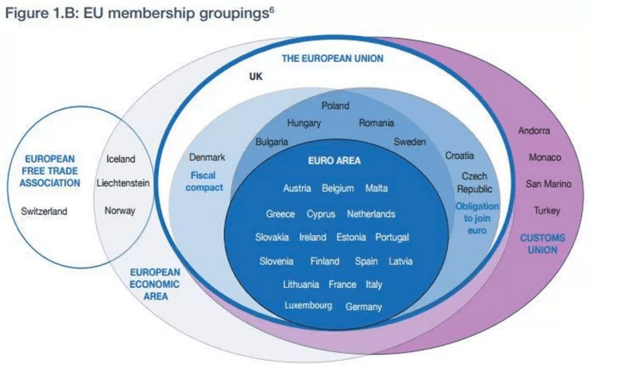
Nevertheless, I’d like to return briefly to the first graph, which – incidentally – is from HM Treasury’s report. As far as I’m concerned, this is the graph of the week because it gives a good picture of the vast number of unions, treaties and zones that actually exist within Europe. It’s just a shame that the BeNeLux is missing…
