http://uk.businessinsider.com/unemployment-rate-advanced-economies-fell-sharply-imf-2016-4
Anyone who, like me, checks out the blogs of various financial sites every day, will often get the feeling that the global economy is in serious trouble right now.
Massive debt, disappointing growth, political division, defaults: nothing but misery, day in, day out. Some economies are doing even worse than others, and it just seems to be a matter of time before we’re facing a new crisis. I see the gloom and doom messages every day, and I have to admit that I often find myself in agreement with them, too. To suggest that the global economy is currently undergoing healthy growth, no. That bond yields have even fallen below zero in many parts, is not exactly a sign of strength, but a sign of impotence, so to say.
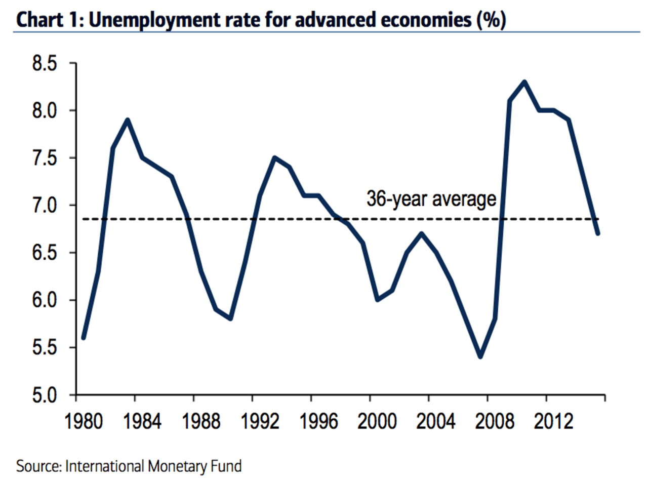
Having said that, the pessimism does seem to have gone a little too far. Although the growth of the global economy is disappointing if you look at industrial production, GDP or trade numbers, it’s not all misery. I expect that this graph of the week will come as a surprise to many, for example. The graph shows the development of unemployment in developed countries since 1980. So? Though growth is indeed disappointing, unemployment has declined strikingly fast in recent years. What’s more, unemployment is now below its 36-year average of 6.8%!
But is that correct?
Now, I’ve seen lots of graphs that upon closer inspection don’t say what you think they do, so let’s just check out whether this one is accurate. The good news: it’s correct. The graph is based on the IMF’s official data and – contrary to what I had initially thought – is not based on predictions but runs nicely up to 2015. So genuinely realized numbers, and not the rose-tinted glasses the IMF usually wears when compiling its predictions.
That was the good news, as for many Europeans the idea that unemployment is below its long-term average will come across as rather improbable. And justifiably, as the following graph indicates, showing not just unemployment in developed countries, but also Eurozone unemployment. Now, although the Eurozone doesn’t have a very long history, it’ll be clear enough that unemployment of 10.5% is anything but below the long-term average …
Source: IMF, Robeco

So, a reason to be somber? Well, no, not really. It’s difficult to deny that unemployment in the Eurozone is so high, but that doesn’t really change the conclusion that unemployment for developed markets as a whole is actually below the long-term average. What’s more, when the Eurozone is well above average, this does not automatically mean that the unemployment situation for the non-Eurozone countries should be any better.
I’ll show you two more graphs. The first shows unemployment numbers for the Eurozone according to the IMF, as applicable at the end of 2015. The black line in this graph corresponds with the dotted line in the last two graphs (6.8%). It’s clear where the pain in the Eurozone actually is: in the south. With the exception of Slovakia, the ‘top’ seven are all countries that are found along the Mediterranean. At the same time, the graph also clearly shows that the high percentage of unemployment of 10.5% for the Eurozone as a whole is primarily down to economic heavyweights like France, Spain and Italy.
Source: IMF, Robeco

The second graph is one that I regularly use in presentations. It looks at national data and relates current unemployment (bars) to the long-term average for each individual country (black lines). These national figures sometimes deviate significantly from the IMF’s numbers, and the long-term average in this graph is not always from 1980. On the other hand, I am looking at the most recent numbers, so I can factor in developments in 2016.

This graph, too, shows the negative outliers of Spain, Italy and the Eurozone, but also shows where the unemployment is clearly below the long-term average: Germany, the UK and the US. Add to that the two countries with the lowest unemployment (China and Japan) and this results in a striking picture: the world’s five largest economies (53% of the total global economy, according to the IMF’s data) are currently enjoying lower-than-historical unemployment percentages. And it’s those economies in particular that play a major role when we’re talking about financial market developments …
So that’s something to bear in mind at moments when the doom and gloom reaches fever pitch.
