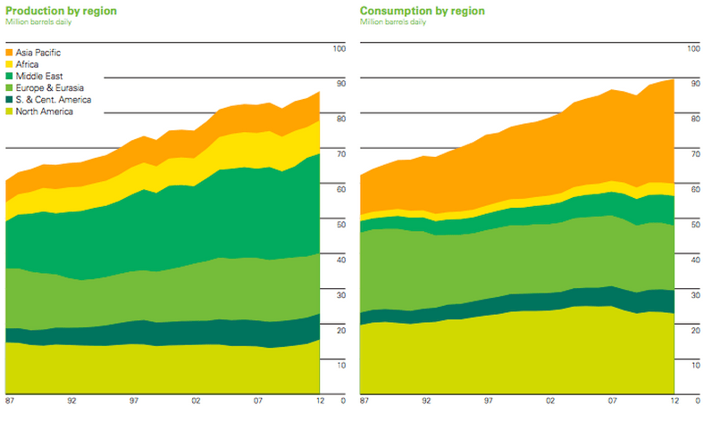
Good morning. BP’s annual statistical review is out! Lot’s of data and charts on Energy… And each year, the question is, how can consumption be structurally higher than production….? http://www.bp.com/content/dam/bp/pdf/statistical-review/statistical_review_of_world_energy_2013.pdf
Today, the Nikkei took another beating, as did the yen (getting more expensive, that is)….
http://www.reuters.com/article/2013/06/13/us-markets-global-idUSBRE88901C20130613
http://www.ft.com/intl/cms/s/0/4a7964a2-d3cd-11e2-b3ff-00144feab7de.html

…and a worrying thing: up till last week, it was not because foreigners were selling….
http://www.zerohedge.com/contributed/2013-06-12/foreign-investors-are-not-behind-nikkeis-swoon
Bond market corrections around the world
http://ftalphaville.ft.com/2013/06/12/1532822/interest-rate-wars/

On MSCI benchmark changes and how Nigeria may be a winner
http://blogs.ft.com/beyond-brics/2013/06/12/msci-reclassifications-a-trillion-dollar-decision/
I am not sure whether I still agree on the line of reasoning, but the chart is worth it nevertheless. Growth vs debt.

And so much for the return of ‘hedge funds’, as an asset class…
http://www.ritholtz.com/blog/2013/06/bad-chart-hedge-funds-long-term-gains/

New data from corelogic on houses that are ‘under water’
http://www.calculatedriskblog.com/2013/06/corelogic-negative-equity-decreases-in.html

Living like a God in…. Romania!
http://www.economist.com/blogs/graphicdetail/2013/06/daily-chart-6

And here The Economist does a little copy-catting from earlier research by Barclays: QE sensitivity
http://www.economist.com/blogs/graphicdetail/2013/06/focus-4

A complete overview of all previous editions of Best of the Web can be found herehttp://tinyurl.com/c8ge4c5. All links provided are collected from public websites, unless otherwise specified. I have not checked the data or information for accuracy used, and therefore do not guarantee that all data provided will be 100% correct. The links provided do not necessarily reflect my personal opinion and should be seen as general interest: oftentimes I do not agree with arguments presented, but nevertheless think it is worthwhile to read them. It is up to the reader to make up their own mind. Suggestions or discussions are more than welcome. Do not quote unless specifically cleared beforehand!

Baas,
het antwoord op je eerste vraag (verschil consumptie en productie) zou in theorie voorraden kunnen zijn. Met vriendelijke groet, With kindest regards, Jitzes Noorman Senior Delegated CIO
Maar dit is een structureel fenomeen, dus ik vermoed dat dat niet de oplossing kan zijn…
http://www.economist.com/blogs/dailychart/2011/06/oil-production-and-consumption?fsrc=scn%2Ftw%2Fte%2Fdc%2FrunningdryPeak
The authors of the BP report have asked us to highlight that a large part of the difference between consumption and production, in the charts above, is accounted for by such things as biofuels, oil made from coal and other non-conventional sources, which are not included in their production figures.
10 points!