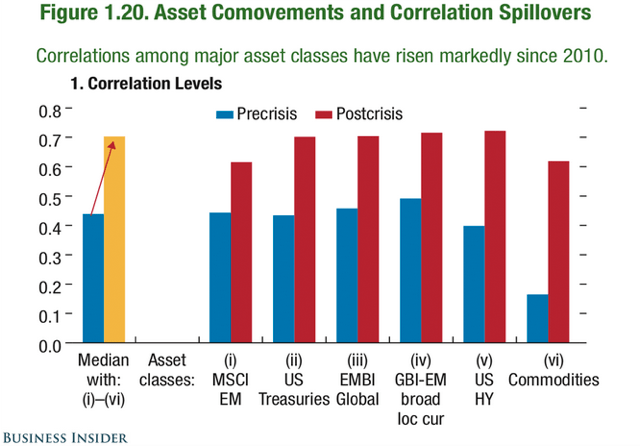
Good morning. Usually a bad sign: correlations are on the rise again
http://uk.businessinsider.com/imf-correlations-among-asset-classes-have-risen-since-2010-2015-4
On what the world could look like, 15 years from now. Or not, of course….
http://www.ritholtz.com/blog/2015/04/worlds-20-largest-economies-in-2030/

Ah, a classic: just plot three lines on top of each other and draw some random conclusions
http://www.ritholtz.com/blog/2015/04/generational-lows-lined-up-overlay-also-suggests-risk-of-cyclical-top-in-2015/

About that strong jump in Chinese stocks: we have seen it before (and we are not even halfway there)

The Fed has already tightened. Or that is what this chart is supposed to show us…
http://blogs.wsj.com/economics/2015/04/17/the-economy-has-slowed-because-the-fed-has-already-tightened/

Asylum seekers
http://www.economist.com/blogs/graphicdetail/2015/04/daily-chart-10

Interactive tool showing the water footprint of various food alternatives
http://graphics.latimes.com/food-water-footprint/

The impact of oil differs across the various US states
http://www.ritholtz.com/blog/2015/04/plunging-oil-prices-a-boost-for-the-u-s-economy-a-jolt-for-texas/

Cool chart on income developments
http://www.washingtonpost.com/blogs/wonkblog/wp/2015/04/20/this-chart-explains-everything-you-need-to-know-about-inequality/

A complete overview of all previous editions of Best of the Web can be found herehttp://tinyurl.com/c8ge4c5. All links provided are collected from public websites, unless otherwise specified. I have not checked the data or information for accuracy used, and therefore do not guarantee that all data provided will be 100% correct. The links provided do not necessarily reflect my personal opinion and should be seen as general interest: oftentimes I do not agree with arguments presented, but nevertheless think it is worthwhile to read them. It is up to the reader to make up their own mind. Suggestions or discussions are more than welcome. Do not quote unless specifically cleared beforehand!
