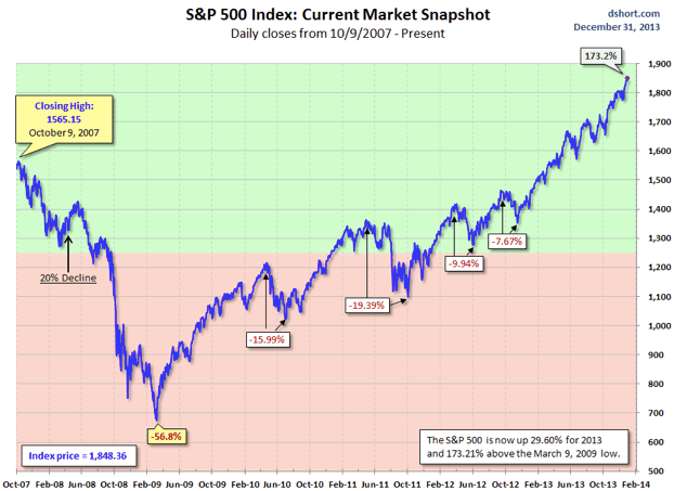
Good Morning. 2013 for the S&P500 was a great year…
http://www.calculatedriskblog.com/2013/12/market-update-happy-new-year.html
First-up: the Best of 2013, as selected by me. TAkes 5 minutes to look through, and it is worth it.
https://lukasdaalder.com/2013/12/22/best-of-the-web-in-2013/

The inescapable overview of the various asset classes in 2013… Equities lead the pack….
http://www.bespokeinvest.com/thinkbig/2013/12/31/2013-asset-class-performance.html

Interesting breakdown of EPS growth in the US, although I am not a 100% sure that this is correct. But still.
http://www.businessinsider.com/breakdown-of-sp-500-eps-growth-2013-12

And this is the overview for bonds….
http://www.ritholtz.com/blog/2013/12/a-somewhat-bursting-bond-bubble/

But why stop by looking back only one year? Why not five years…?
http://www.nytimes.com/2013/12/30/opinion/america-in-2013-as-told-in-charts.html

This looks pretty worrying, but then again, can anyone tell me any of the pre-announcements that have taken place so far…?
http://www.businessinsider.com/negative-to-positive-earnings-preannouncements-2013-12

Interesting read (although old) on the developments in the FX markets. Look at the right hand chart on algorithmic trading… (via +Jeremy Clift)

Exactly the point I made earlier, about crap works…
http://philosophicaleconomics.wordpress.com/2013/12/23/valuation-and-returns-adventures-in-curve-fitting/comment-page-1/#comment-711

Interesting chart on the breakdown and size of debt in China and the US…
http://www.businessinsider.com/outstanding-debt-in-us-china-2013-12

Wells Fargo’s favorite charts of 2013. I like mine better, of course, but this one is worth it nevertheless. 🙂
https://www08.wellsfargomedia.com/downloads/pdf/com/insights/economics/special-reports/Our_Favorite_Charts_of_2013_12232013.pdf

Good question: “Is Bitcoin a Real Currency?” Well, it is volatile for sure… (via Roderick Molenaar)

Food availability in the world during the past fifty years…
http://www.economist.com/blogs/graphicdetail/2013/12/daily-chart-21

Interesting chart on murders in New York city. And yes, there is a chart correcting for increased population as well…
http://qz.com/162289/217-years-of-homicide-in-new-york/

A complete overview of all previous editions of Best of the Web can be found herehttp://tinyurl.com/c8ge4c5. All links provided are collected from public websites, unless otherwise specified. I have not checked the data or information for accuracy used, and therefore do not guarantee that all data provided will be 100% correct. The links provided do not necessarily reflect my personal opinion and should be seen as general interest: oftentimes I do not agree with arguments presented, but nevertheless think it is worthwhile to read them. It is up to the reader to make up their own mind. Suggestions or discussions are more than welcome. Do not quote unless specifically cleared beforehand!
