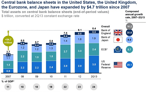
Good Morning. 24%? Let’s make that an even 30%, okay?
http://www.economist.com/blogs/freeexchange/2013/11/unconventional-monetary-policy
I am a sucker for these kind of charts: IPO revenue from 2000 onward

http://qz.com/146895/bankers-will-walk-away-from-the-ipo-boom-smiling-even-if-investors-dont/
Article on equity in European banks and flow of funds data
http://www.voxeu.org/article/assessing-leverage-through-flow-data

The ECB takes a crack on measuring potential growth (via @leonmwc)

Van Gogh still leads the charts!
http://www.economist.com/blogs/graphicdetail/2013/11/daily-chart-7

Yet another way to show that stocks are eh… well… let’s say enthusiastic (mind the axis though)

http://www.zerohedge.com/news/2013-11-14/qeeen-sends-stocks-soaring-moar-new-highs-bonds-bullion-bid
…and this is what Europe looks like….
http://www.zerohedge.com/news/2013-11-14/wtf-chart-day-european-equities-edition

Interesting: the relationship between uncertainty and investment seems to be inverse

A complete overview of all previous editions of Best of the Web can be found herehttp://tinyurl.com/c8ge4c5. All links provided are collected from public websites, unless otherwise specified. I have not checked the data or information for accuracy used, and therefore do not guarantee that all data provided will be 100% correct. The links provided do not necessarily reflect my personal opinion and should be seen as general interest: oftentimes I do not agree with arguments presented, but nevertheless think it is worthwhile to read them. It is up to the reader to make up their own mind. Suggestions or discussions are more than welcome. Do not quote unless specifically cleared beforehand!
