During the past couple of weeks numerous analyses have been presented on various blogs (for example here, here and here) claiming that stocks are expensive and that the future returns will therefore be limited at best. Most of these claims are based on the relationship between a valuation measure (often the renowned Shiller P/E) and the 10 year subsequent returns in stocks. Graphically, it looks somewhat like this, all based on the information you can download from de Shiller database:
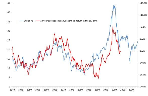
In this chart, the blue line represents the Shiller P/E, while the red line shows the nominal annual returns you would have made in the subsequent 10 years. The red line is basically forward looking, which also explains why it only runs until 2003 (which represents the return for the period 2003-2013).Also, note that the axis for the red line is inverted: the higher it goes, the poorer the return. The message is pretty simple: the more expensive stocks are (blue line rising), the lower the returns of the next ten years will turn out to be. And with blue going up, red is soon to follow, the argument goes.
—
It’s a pretty neat fit, right? In fact, the track-record during the 50’s and 60’s is downright impressive: the turning points in the Shiller PE accurately match the increases and declines in the ten subsequent years. Based on that tight fit, you are even willing to ignore the gap that appeared following the 1987 crash and the internet bubble: the blue line still manages to pinpoint the turning points in the nominal returns.
In fact, looking at the chart, I was left with the feeling that the fit was a little bit too tight. How can average earnings over the past ten years so accurately predict the returns that follow in the ten years after? I would have expected some sort of correlation, but such a close fit got me wondering…
As it turns out, the reason is pretty simple: it’s the price factor. In both these lines, the current price of the S&P500 is used. In the blue line it is in the noun (P/E), in the red line it is in denominator (P+10/P), but given that we are looking at an inverse ax, for all intents and purposes it is in the noun as well.
So, how important is this? Pretty important, it turns out. To show the impact I have created a new valuation measure. Rather than the P/E, I have constructed the CRAP indicator and plotted that versus the ten year subsequent returns. And here are the results:
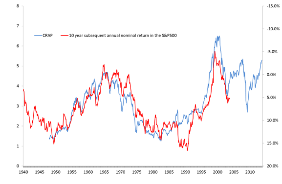
CRAP works! Look at that track-record in 1950-85! Even better than the Shiller PE!!!
So, what is the secret recipe of CRAP? For the record, it is comprised of the total number of US jobs, a deflator and the S&P500, but that is not the point. The point is that there is no valuation measure in it, no link to publically traded companies whatsoever. It’s pretty crap, which served my purpose just fine. My aim never was to find a superior valuation matrix, but rather to show that the observed ‘fit’ was for a large part artificial. All I was looking for was an underlying series that sort of tracked the real economy, showing that the price effect has been the dominating factor explaining the short term swings, creating the feeling of a tight fit. My point is that it is the tight fit that creates the idea that this is a strong and reliable relationship, while in fact it has nothing to do with the underlying valuation at all. It is price driven for both series.
For the record: this is not an attempt to discredit the Shiller PE. I personally think that it is a pretty useful stand-alone valuation tool and the fact that it has risen sharply in recent years is definitely a cause for concern. Having said that, the link between the Shiller PE and future returns is far less perfect than these charts seem to suggest…
This article is written on personal title. A complete overview of all previous editions of Best of the Web can be found herehttp://tinyurl.com/c8ge4c5. All links provided are collected from public websites, unless otherwise specified. I have not checked the data or information for accuracy used, and therefore do not guarantee that all data provided will be 100% correct. The links provided do not necessarily reflect my personal opinion and should be seen as general interest: oftentimes I do not agree with arguments presented, but nevertheless think it is worthwhile to read them. It is up to the reader to make up their own mind. Suggestions or discussions are more than welcome. Do not quote unless specifically cleared beforehand!

Pingback: Morning News: November 19, 2013 Crossing Wall Street
Pingback: Best of the Web: 14-01-02, nr 906 | Best in Economics
Pingback: Best of the Web: 14-07-29, nr 1031 | Best of the Web